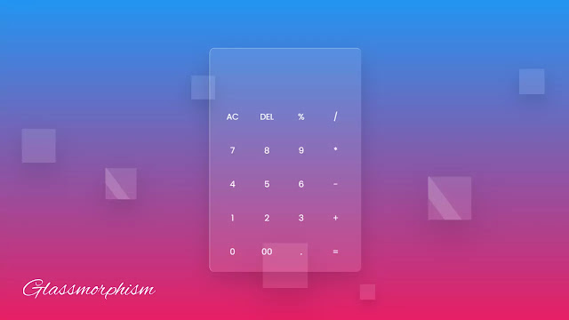
Hello Readers, welcome to my new blog, today in this blog I’m going to make a calculator using HTML CSS & JavaScript. Earlier I have shared, How To Make a Responsive Website With HTML & CSS, that website was in glassmorphism UI, and now this calculator design is also in glass morphism UI.
As we know, a Calculator is a mechanical device that is used to calculate numerical numbers. There are various types and designs of calculators that we can found but the main motive of the calculator is calculation.
As you can see on the given image of this program [Glasss Morphism Calculator], on the webpage. There is one calculator design in glassmorphism UI. All essential buttons are available there like addition, subtraction, multiplication, divide, and so on. These all buttons worked perfectly. Those different sizes of small boxes around that calculator make this glassmorphism design of the calculator really awesome. These all small boxes move upward direction continuously.
If you want the real animation of these small boxes and the code behind making this calculator, you can watch the full video tutorial of this program [Animated Glass Morphism Calculator].
Tutorial of Calculator using HTML CSS & JavaScript
As you have seen in the video tutorial of this program, This calculator works perfectly. To make this I have used simple javascript code to make it easier for everybody. Those small boxes around this calculator animated very nicely which helps to make this glass morphism calculator more attractive. I have also added a hover effect on every button in glassmorphism effect.
Those friend whos are familiar with HTML CSS & JavaScript, they build this program [ Working Calculator ], If you are feeling difficulties to create this program, don’t worry I have provided full source code below.
You Might Like This:
Glassmorphism Calculator [ Source Code ]
To copy-paste the given codes of this program [JavaScript Calculator], first of all, you need to create two files, one is an HTML file and another is a CSS file, after creating these two files you can copy-paste the all given codes easily. You can also download all source code files from the given “Download Button ” directly.
<!DOCTYPE html>
<!-- Created By CodingLab - www.codinglabweb.com -->
<html lang="en" dir="ltr">
  <head>
    <meta charset="UTF-8">
     <title> Glassmorphism Calculator| CodingLab </title>
    <link rel="stylesheet" href="style.css">
   </head>
<body>
<div class="bubbles">
  <span class="one"></span>
  <span class="two"></span>
  <span class="three"></span>
  <span class="four"></span>
  <span class="five"></span>
  <span class="six"></span>
  <span class="seven"></span>
  <span class="seven"></span>
</div>
<div class="bubbles">
  <span class="one"></span>
  <span class="two"></span>
  <span class="three"></span>
  <span class="four"></span>
  <span class="five"></span>
  <span class="six"></span>
  <span class="seven"></span>
  <span class="seven"></span>
</div>
<div class="bubbles">
  <span class="one"></span>
  <span class="two"></span>
  <span class="three"></span>
  <span class="four"></span>
  <span class="five"></span>
  <span class="six"></span>
  <span class="seven"></span>
  <span class="seven"></span>
</div>
<div class="bubbles">
  <span class="one"></span>
  <span class="two"></span>
  <span class="three"></span>
  <span class="four"></span>
  <span class="five"></span>
  <span class="six"></span>
  <span class="seven"></span>
  <span class="seven"></span>
</div>
 <div class="container">
   <form action="#" name="forms">
     <input type="text" name="answer">
     <div class="buttons">
       <input type="button" value="AC" onclick="forms.answer.value = ''">
       <input type="button" value="DEL" onclick="forms.answer.value = forms.answer.value.substr(0 , forms.answer.value.length -1)">
       <input type="button" value="%" onclick="forms.answer.value += '%'">
       <input type="button" value="/" onclick="forms.answer.value += '/'">
     </div>
     <div class="buttons">
       <input type="button" value="7" onclick="forms.answer.value += '7'">
       <input type="button" value="8" onclick="forms.answer.value += '8'">
       <input type="button" value="9" onclick="forms.answer.value += '9'">
       <input type="button" value="*" onclick="forms.answer.value += '*'">
     </div>
     <div class="buttons">
       <input type="button" value="4" onclick="forms.answer.value += '4'">
       <input type="button" value="5" onclick="forms.answer.value += '5'">
       <input type="button" value="6" onclick="forms.answer.value += '6'">
       <input type="button" value="-" onclick="forms.answer.value += '-'">
     </div>
     <div class="buttons">
       <input type="button" value="1" onclick="forms.answer.value += '1'">
       <input type="button" value="2" onclick="forms.answer.value += '2'">
       <input type="button" value="3" onclick="forms.answer.value += '3'">
       <input type="button" value="+" onclick="forms.answer.value += '+'">
     </div>
     <div class="buttons">
       <input type="button" value="0"  onclick="forms.answer.value += '0'">
       <input type="button" value="00" onclick="forms.answer.value += '00'">
       <input type="button" value="." onclick="forms.answer.value += '.'">
       <input type="button" value="=" onclick="forms.answer.value = eval(forms.answer.value)">
     </div>
   </form>
 </div>
</body>
</html>
@import url('https://fonts.googleapis.com/css2?family=Poppins:wght@200;300;400;500;600;700&display=swap');
*{
  margin: 0;
  padding: 0;
  box-sizing: border-box;
  font-family: 'Poppins',sans-serif;
}
body{
  height: 100vh;
  width: 100%;
  overflow: hidden;
  display: flex;
  justify-content: center;
  align-items: center;
  background: linear-gradient(#2196f3 , #e91e63);
}
.bubbles{
  position: absolute;
  bottom: -120px;
  display: flex;
  flex-wrap: wrap;
  margin-top: 70px;
  width: 100%;
  justify-content: space-around;
}
.bubbles span{
  height: 60px;
  width: 60px;
  background: rgba(255, 255, 255, 0.1);
  animation: move 10s linear infinite;
  position: relative;
  overflow: hidden;
}
@keyframes move {
  100%{
    transform: translateY(-100vh);
  }
}
.bubbles span.one{
  animation-delay: 2.2s;
  transform: scale(2.15)
}
.bubbles span.two{
  animation-delay: 3.5s;
  transform: scale(1.55)
}
.bubbles span.three{
  animation-delay: 0.2s;
  transform: scale(0.35)
}
.bubbles span.four{
  animation-delay: 6s;
  transform: scale(2.15)
}
.bubbles span.five{
  animation-delay: 7s;
  transform: scale(0.5)
}
.bubbles span.six{
  animation-delay: 4s;
  transform: scale(2.5)
}
.bubbles span.seven{
  animation-delay: 3
  transform: scale(1.5)
}
.bubbles span:before{
  content: '';
  position: absolute;
  left: 0;
  top: 0;
  height: 60px;
  width: 40%;
  transform: skew(45deg) translateX(150px);
  background: rgba(255, 255, 255, 0.15);
  animation: mirror 3s linear infinite;
}
@keyframes mirror {
  100%{
    transform: translateX(-450px);
  }
}
.bubbles span.one:before{
  animation-delay: 1.5s;
}
.bubbles span.two:before{
  animation-delay: 3.5s;
}
.bubbles span.three:before{
  animation-delay: 2.5s;
}
.bubbles span.four:before{
  animation-delay: 7.5s;
}
.bubbles span.five:before{
  animation-delay: 4.5s;
}
.bubbles span.six:before{
  animation-delay: 0.5s;
}
.bubbles span.seven:before{
  animation-delay: 6s;
}
.container{
  z-index: 12;
  width: 360px;
  padding: 15px;
  border-radius: 12px;
  background: rgba(255, 255, 255, 0.1);
  box-shadow: 0 20px 50px rgba(0, 0, 0, 0.15);
  border-top: 1px solid rgba(255, 255, 255, 0.5);
  border-left: 1px solid rgba(255, 255, 255, 0.5);
}
.container input[type="text"]{
  width: 100%;
  height: 100px;
  margin: 0 3px;
  outline: none;
  border: none;
  color: #fff;
  font-size: 20px;
  text-align: right;
  padding-right: 10px;
  pointer-events: none;
  background: transparent;
}
.container input[type="button"]{
  height: 65px;
  color: #fff;
  width: calc(100% / 4 - 5px);
  background: transparent;
  border-radius: 12px;
  margin-top: 15px;
  outline: none;
  border: none;
  font-size: 20px;
  cursor: pointer;
  transition: all 0.3s ease;
}
.container input[type="button"]:hover{
  background: rgba(255, 255, 255, 0.1);
}
If you face any difficulties while creating your Calculator or your code is not working as expected, you can download the source code files for this Glassmorphism Calculator for free by clicking on the download button, and you can also view a live demo of this card slider by clicking on the view live button.


