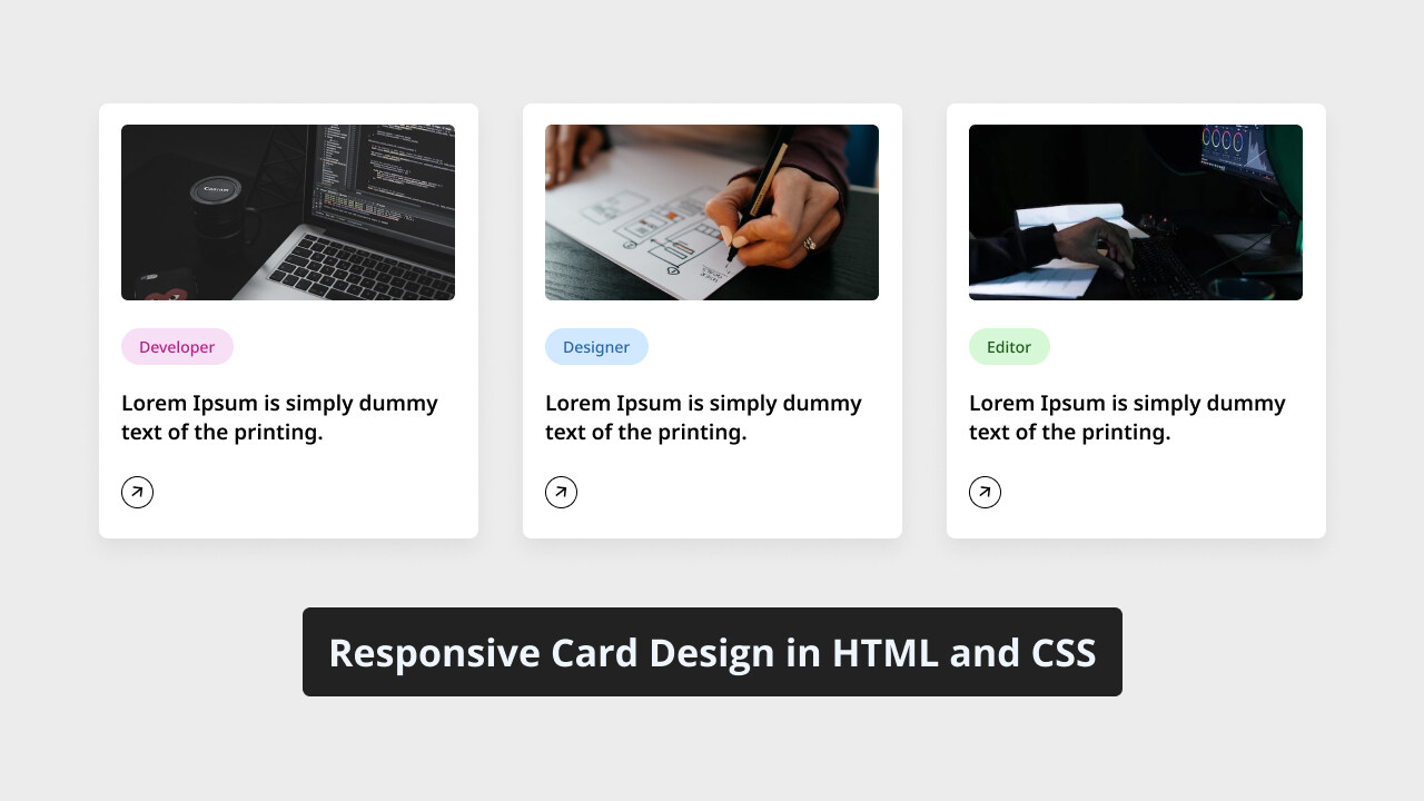
You may have seen cards on different websites. Cards are important web elements used to showcase short articles, product descriptions, or user profiles. If you’re a beginner web developer, creating responsive cards can be a valuable project to understand CSS fundamental concepts such as positing, flexbox, and grid layouts.
In this blog post, I will guide you through the process of creating a responsive card design using HTML and CSS. There will be 3 cards displayed on the screen; each card contains an image, a title, and a button. When you hover over the card, a simple border animation will appear.
To create this card, we will use commonly used HTML elements such as div a, image, heading, and basic CSS properties to style the card and make it responsive. This project is simple and straightforward, so you should not have any trouble following the steps and understanding the codes.
Steps to Create Responsive Card in HTML and CSS
To create a responsive card design using HTML and CSS, follow these simple step-by-step instructions:
- First, create a folder with any name you like. Then, put the necessary files inside it.
- Create a file called
index.htmlto serve as the main file. - Create a file called
style.cssfor the CSS code. - Finally, download the Images folder and place it in your project directory. This folder contains all the images you’ll need for this card project.
To start, add the following HTML codes to your index.html file: This code includes essential HTML markup with different semantic tags like div, image, and heading to create our card layout.
<!DOCTYPE html>
<!-- Coding By CodingNepal - www.codingnepalweb.com -->
<html lang="en">
<head>
    <meta charset="UTF-8">
    <meta name="viewport" content="width=device-width, initial-scale=1.0">
    <title>Responsive Card Design HTML and CSS | CodingNepal</title>
    <!-- Font Awesome Icons -->
    <link rel="stylesheet" href="https://cdnjs.cloudflare.com/ajax/libs/font-awesome/6.4.2/css/all.min.css">
    <!-- Custom CSS -->
    <link rel="stylesheet" href="style.css">
</head>
<body>
    <div class="card-list">
        <a href="#" class="card-item">
            <img src="images/developer.jpg" alt="Card Image">
            <span class="developer">Developer</span>
            <h3>A "developer" codes software and websites.</h3>
            <div class="arrow">
                <i class="fas fa-arrow-right card-icon"></i>
            </div>
        </a>
        <a href="#" class="card-item">
            <img src="images/designer.jpg" alt="Card Image">
            <span class="designer">Designer</span>
            <h3>A "designer" is a design expert.</h3>
            <div class="arrow">
                <i class="fas fa-arrow-right card-icon"></i>
            </div>
        </a>
        <a href="#" class="card-item">
            <img src="images/editor.jpg" alt="Card Image">
            <span class="editor">Editor</span>
            <h3>An "editor" ensures content quality and accuracy.</h3>
            <div class="arrow">
                <i class="fas fa-arrow-right card-icon"></i>
            </div>
        </a>
    </div>
</body>
</html>
Next, add the following CSS codes to your style.css file to make your card stylish and responsive. Feel free to experiment with different CSS properties, such as colors, fonts, backgrounds, etc., to make your card even more beautiful.
/* Importing Google font - Open Sans */
@import url('https://fonts.googleapis.com/css2?family=Open+Sans:wght@300;400;500;600;700&display=swap');

* {
    margin: 0;
    padding: 0;
    box-sizing: border-box;
    font-family: 'Open Sans', sans-serif;
}

body {
    background: #ecececdb;
}

.card-list {
    display: grid;
    grid-template-columns: repeat(auto-fill, minmax(300px, 1fr));
    max-width: 1250px;
    margin: 150px auto;
    padding: 20px;
    gap: 20px;
}

.card-list .card-item {
    background: #fff;
    padding: 26px;
    border-radius: 8px;
    box-shadow: 0px 5px 10px rgba(0, 0, 0, 0.04);
    list-style: none;
    cursor: pointer;
    text-decoration: none;
    border: 2px solid transparent;
    transition: border 0.5s ease;
}

.card-list .card-item:hover {
    border: 2px solid #000;
}

.card-list .card-item img {
    width: 100%;
    aspect-ratio: 16/9;
    border-radius: 8px;
    object-fit: cover;
}

.card-list span {
    display: inline-block;
    background: #F7DFF5;
    margin-top: 32px;
    padding: 8px 15px;
    font-size: 0.75rem;
    border-radius: 50px;
    font-weight: 600;
}

.card-list .developer {
    background-color: #F7DFF5;
    color: #B22485;
}

.card-list .designer {
    background-color: #d1e8ff;
    color: #2968a8;
}

.card-list .editor {
    background-color: #d6f8d6;
    color: #205c20;
}

.card-item h3 {
    color: #000;
    font-size: 1.438rem;
    margin-top: 28px;
    font-weight: 600;
}

.card-item .arrow {
    display: flex;
    align-items: center;
    justify-content: center;
    transform: rotate(-35deg);
    height: 40px;
    width: 40px;
    color: #000;
    border: 1px solid #000;
    border-radius: 50%;
    margin-top: 40px;
    transition: 0.2s ease;
}

.card-list .card-item:hover .arrow  {
    background: #000;
    color: #fff;
}

@media (max-width: 1200px) {
    .card-list .card-item {
        padding: 15px;
    }
}

@media screen and (max-width: 980px) {
    .card-list {
        margin: 0 auto;
    }
}
Conclusion and final words
In conclusion, creating responsive CSS cards is a simple but practical project for beginner web developers to apply their newly learned HTML and CSS skills. I believe that by following the steps and the codes in this post, you’ve successfully created your own CSS cards.
To further improve your skills in HTML and CSS, I suggest you try recreating other practical website elements such as card designs, login forms, navigation bars, website homepages, etc.
If you encounter any problems while creating your responsive card design, you can download the source code files for this form project for free by clicking the Download button. You can also view a live demo of it by clicking the View Live button.


