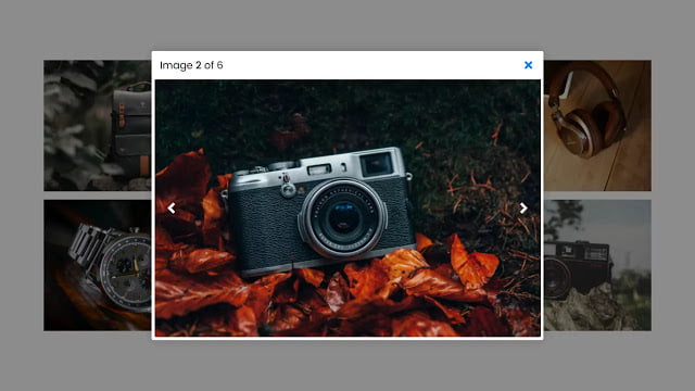
Hey friends, today in this blog you’ll learn how to create Responsive Image Lightbox using HTML CSS & JavaScript. Earlier I have shared a blog on how to create a Responsive Filterable Image Gallery in JavaScript and now it’s time to create Image Lightbox.
You may have seen image lightbox on many websites. Lightbox showcases images and videos by filling the screen and dimming out the rest of the web page. In the image lightbox, there are slide controls so you can easily change the image to next or previous. There are many JavaScript libraries for lightbox but today in this blog I’ll show you how to create lightbox without using the JavaScript library or jQuery plugin.
In this program [Responsive Image Lightbox], there are six images on the webpage and when you click on the particular image then the lightbox appears with the selected image. In the lightbox, there is a total image and current image number on the top left side and a cross icon on the top right side. There are also previous and next icons to change the image. When you click on the cross icon then the lightbox will disappear and after again clicking on the particular image, the lightbox appears.
This image gallery and lightbox are fully responsive for all devices. On the pc, there are 3 three images in a single row but on the mobile devices, there is only one image in the single row. If you’re feeling difficulty understanding what I’m saying then you can watch a full video tutorial of this responsive image lightbox.
Video Tutorial of Responsive Image Lightbox
In the video, you have seen the preview or demo of the responsive image lightbox and how I created this. As you know, I didn’t use any JavaScript library to create this image lightbox. If you’re a beginner then you may have difficulties to understanding the JavaScript codes of this program but don’t worry I’ve tried to explain each JavaScript line with writing comments so once you download the code files you’ll easily understand the codes.
You might like this:
Responsive Image Lightbox [Source Codes]
To create this program [Responsive Image Lightbox]. First, you need to create three files, HTML File, CSS File, and JavaScript File. After creating these files just paste the following codes into your files. You can also download the source code files of this image lightbox from the given download button.
First, create an HTML file with the name of index.html and paste the given codes in your HTML file. Remember, you’ve to create a file with .html extension and the images that are used on this lightbox won’t appear. You’ve to download files from the given download button to use images also.
<!DOCTYPE html>
<!-- Created By CodingNepal - www.codingnepalweb.com -->
<html lang="en">
<head>
    <meta charset="UTF-8">
    <!--- Don't forget to add this meta tag otherwise your design won't responsive ---->
    <meta name="viewport" content="width=device-width, initial-scale=1.0">
    <title>Responsive Image Lightbox | CodingNepal</title>
    <link rel="stylesheet" href="style.css">
    <link rel="stylesheet" href="https://cdnjs.cloudflare.com/ajax/libs/font-awesome/5.15.3/css/all.min.css"/>
</head>
<body>
  <div class="wrapper">
    <div class="gallery">
      <div class="image"><span><img src="images/img-1.jpg" alt=""></span></div>
      <div class="image"><span><img src="images/img-2.jpg" alt=""></span></div>
      <div class="image"><span><img src="images/img-3.jpg" alt=""></span></div>
      <div class="image"><span><img src="images/img-4.jpg" alt=""></span></div>
      <div class="image"><span><img src="images/img-5.jpg" alt=""></span></div>
      <div class="image"><span><img src="images/img-6.jpg" alt=""></span></div>
    </div>
  </div>
  <div class="preview-box">
    <div class="details">
      <span class="title">Image <p class="current-img"></p> of <p class="total-img"></p></span>
      <span class="icon fas fa-times"></span>
    </div>
    <div class="image-box">
      <div class="slide prev"><i class="fas fa-angle-left"></i></div>
      <div class="slide next"><i class="fas fa-angle-right"></i></div>
      <img src="" alt="">
    </div>
  </div>
  <div class="shadow"></div>

  <script src="script.js"></script>

</body>
</html>
Second, create a CSS file with the name of style.css and paste the given codes in your CSS file. Remember, you’ve to create a file with .css extension.
@import url('https://fonts.googleapis.com/css2?family=Poppins:wght@200;300;400;500;600;700&display=swap');
*{
  margin: 0;
  padding: 0;
  box-sizing: border-box;
  font-family: 'Poppins', sans-serif;
}
::selection{
  color: #fff;
  background: #007bff;
}
body{
  padding: 10px;
  display: flex;
  align-items: center;
  justify-content: center;
  min-height: 100vh;
}
.wrapper{
  max-width: 1100px;
}
.gallery{
  display: flex;
  flex-wrap: wrap;
}
.gallery .image{
  padding: 7px;
  width: calc(100% / 3);
}
.gallery .image span{
  display: flex;
  width: 100%;
  overflow: hidden;
}
.gallery .image img{
  width: 100%;
  vertical-align: middle;
  transition: all 0.3s ease;
}
.gallery .image:hover img{
  transform: scale(1.1);
}

.preview-box{
  position: fixed;
  top: 50%;
  left: 50%;
  transform: translate(-50%, -50%) scale(0.9);
  background: #fff;
  max-width: 700px;
  width: 100%;
  z-index: 5;
  opacity: 0;
  pointer-events: none;
  border-radius: 3px;
  padding: 0 5px 5px 5px;
  box-shadow: 0px 0px 15px rgba(0,0,0,0.2);
}
.preview-box.show{
  opacity: 1;
  pointer-events: auto;
  transform: translate(-50%, -50%) scale(1);
  transition: all 0.3s ease;
}
.preview-box .details{
  display: flex;
  align-items: center;
  padding: 12px 15px 12px 10px;
  justify-content: space-between;
}
.preview-box .details .title{
  display: flex;
  font-size: 18px;
  font-weight: 400;
}
.details .title p{
  margin: 0 5px;
}
.details .title p.current-img{
  font-weight: 500;
}
.details .icon{
  color: #007bff;
  font-size: 20px;
  cursor: pointer;
}
.preview-box .image-box{
  display: flex;
  width: 100%;
  position: relative;
}
.image-box .slide{
  position: absolute;
  top: 50%;
  transform: translateY(-50%);
  color: #fff;
  font-size: 30px;
  cursor: pointer;
  height: 50px;
  width: 60px;
  line-height: 50px;
  text-align: center;
  border-radius: 3px;
}
.slide.prev{
  left: 0px;
}
.slide.next{
  right: 0px;
}
.image-box img{
  width: 100%;
  border-radius: 0 0 3px 3px;
}
.shadow{
  position: fixed;
  top: 0;
  left: 0;
  height: 100%;
  width: 100%;
  z-index: 2;
  display: none;
  background: rgba(0,0,0,0.45);
}

@media(max-width: 1000px){
  .gallery .image{
    width: calc(100% / 2);
  }
}
@media(max-width: 600px){
  .gallery .image{
    width: 100%;
    padding: 4px;
  }
}
Last, create a JavaScript file with the name of script.js and paste the given codes in your JavaScript file. Remember, you’ve to create a file with .js extension.
//getting all required elements
const gallery  = document.querySelectorAll(".image"),
previewBox = document.querySelector(".preview-box"),
previewImg = previewBox.querySelector("img"),
closeIcon = previewBox.querySelector(".icon"),
currentImg = previewBox.querySelector(".current-img"),
totalImg = previewBox.querySelector(".total-img"),
shadow = document.querySelector(".shadow");

window.onload = ()=>{
    for (let i = 0; i < gallery.length; i++) {
        totalImg.textContent = gallery.length; //passing total img length to totalImg variable
        let newIndex = i; //passing i value to newIndex variable
        let clickedImgIndex; //creating new variable

        gallery[i].onclick = () =>{
            clickedImgIndex = i; //passing cliked image index to created variable (clickedImgIndex)
            function preview(){
                currentImg.textContent = newIndex + 1; //passing current img index to currentImg varible with adding +1
                let imageURL = gallery[newIndex].querySelector("img").src; //getting user clicked img url
                previewImg.src = imageURL; //passing user clicked img url in previewImg src
            }
            preview(); //calling above function

            const prevBtn = document.querySelector(".prev");
            const nextBtn = document.querySelector(".next");
            if(newIndex == 0){ //if index value is equal to 0 then hide prevBtn
                prevBtn.style.display = "none";
            }
            if(newIndex >= gallery.length - 1){ //if index value is greater and equal to gallery length by -1 then hide nextBtn
                nextBtn.style.display = "none";
            }
            prevBtn.onclick = ()=>{
                newIndex--; //decrement index
                if(newIndex == 0){
                    preview();
                    prevBtn.style.display = "none";
                }else{
                    preview();
                    nextBtn.style.display = "block";
                }
            }
            nextBtn.onclick = ()=>{
                newIndex++; //increment index
                if(newIndex >= gallery.length - 1){
                    preview();
                    nextBtn.style.display = "none";
                }else{
                    preview();
                    prevBtn.style.display = "block";
                }
            }
            document.querySelector("body").style.overflow = "hidden";
            previewBox.classList.add("show");
            shadow.style.display = "block";
            closeIcon.onclick = ()=>{
                newIndex = clickedImgIndex; //assigning user first clicked img index to newIndex
                prevBtn.style.display = "block";
                nextBtn.style.display = "block";
                previewBox.classList.remove("show");
                shadow.style.display = "none";
                document.querySelector("body").style.overflow = "scroll";
            }
        }

    }
}
That’s all, now you’ve successfully created a Responsive Image Lightbox using HTML CSS & JavaScript. If your code doesn’t work or you’ve faced any error/problem then please download the source code files from the given download button. It’s free and a .zip file will be downloaded then you’ve to extract it.


