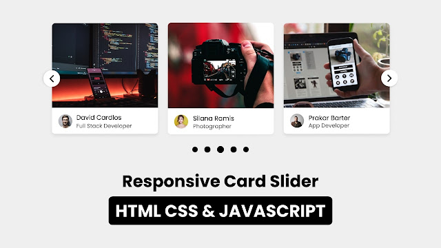
In YouTube, Netflix, Facebook and other platform you may have seen and used image, text or videos carousel or sliding option form where you can get other content by sliding it. Did you know we can make that type of Card Slider just using HTML CSS and JavaScript with Swiper Js plugin.
Yes, today you will to create a Responsive Card Slider in HTML CSS JavaScript with SwiperJs plugin. Even though you are beginner at HTML CSS and JavaScript and don’t know to use plugin like SwiperJs then also you will be able to create that crousal easily after reading this blog. There are lots of Cards & Card Slider I already have created. In this card slider you will find more function and design.
Card slider are the combination of two or more than two cards that are slideable right or left. These types of card are available on the website or in the application which contains some specific information in a brief way.
Take a look on the given image of our Card Slider. As you can see there, there are total three cards with different image, name and job. At the first and last card’s middle we can see button, obviously that is used to slide card right of left. Also, we can slide those card by grabbing cursor on it. Intresting thing on this project is that I have also added pagination. This card slider will be fully responsive.
To see the real demo of this card slider or carousel and all the code that I have used to create this card slider, you can watch the video tutorial. After watching the given video tutorial you will also know to how HTML and CSS coder are working behind this card slider and how to use swiperjs.
Card Slider in HTML CSS JavaScript | SwiperJs | Video Tutorial
You would be wondering to getting all the HTML CSS and JavaScript/SwieprJs code that I have used to create this Card Slider, don’t worry I have provided all the source code files below. Before getting into the source code file, I would like to explain given video tutorial of our project sliding card briefly.
As you have seen in the video tutorial of our Carousel. you have seen there. At first there was total three cards with image, information, buttons and pagination. When I clicked on the right side button the card slid to those left and next card appeared. Simailarly when I clicked on the right side button those card slid right and next card appeared.
Also, we were able slide card by grabbing cursor on it. Those card were fully responsive, I have show you by resizing the screen. In the small device screen those nav button was hidden. To create this project this card slider I used HTML CSS and Swiperjs, which you already have watched in the video tutorial.
I hope, now you are able to create this Card Slider using HTML CSS and JavaScript with using plugin like SwiperJs. If you are feeling difficulty to create this sliding card, all the source code are given below.
You May Like This:
Card Slider in HTML CSS & JS | SwiperJs [Source Code]
To create Card Slider in HTML CSS & JS, follow the given steps line by line:
- Create a folder. You can name this folder whatever you want, and inside this folder, create the mentioned files.
- Create an
index.htmlfile. The file name must be index and its extension .html - Create a
style.cssfile. The file name must be style and its extension .css
Once you create these files, paste the given codes into the specified files. If you don’t want to do these then scroll down and download the Card Slider in HTML CSS & JS by clicking on the given download button.
First, paste the following codes into your index.html file.
<!DOCTYPE html>
<!-- Coding By CodingNepal - codingnepalweb.com -->
<html lang="en">
  <head>
    <meta charset="UTF-8" />
    <meta http-equiv="X-UA-Compatible" content="IE=edge" />
    <meta name="viewport" content="width=device-width, initial-scale=1.0" />
   <title>Responsive Card Slider in HTML CSS & JavaScript with Swiperjs</title>

    <!-- Swiper CSS -->
    <link rel="stylesheet" href="css/swiper-bundle.min.css" />

    <!-- CSS -->
    <link rel="stylesheet" href="css/style.css" />
  </head>
  <body>
    <div class="container swiper">
      <div class="slide-container">
        <div class="card-wrapper swiper-wrapper">
          <div class="card swiper-slide">
            <div class="image-box">
              <!--<img src="images/showImg/fullDev.jpg" alt="" />-->
            </div>
            <div class="profile-details">
              <!--<img src="images/profile/profile1.jpg" alt="" />-->
              <div class="name-job">
                <h3 class="name">David Cardlos</h3>
                <h4 class="job">Full Stack Developer</h4>
              </div>
            </div>
          </div>
          <div class="card swiper-slide">
            <div class="image-box">
              <!--<img src="images/showImg/photographer.jpg" alt="" />-->
            </div>
            <div class="profile-details">
              <!--<img src="images/profile/profile2.jpg" alt="" />-->
              <div class="name-job">
                <h3 class="name">Siliana Ramis</h3>
                <h4 class="job">Photographer</h4>
              </div>
            </div>
          </div>
          <div class="card swiper-slide">
            <div class="image-box">
              <!--<img src="images/showImg/dataAna.jpg" alt="" />-->
            </div>
            <div class="profile-details">
              <!--<img src="images/profile/profile3.jpg" alt="" />-->
              <div class="name-job">
                <h3 class="name">Richard Bond</h3>
                <h4 class="job">Data Analyst</h4>
              </div>
            </div>
          </div>
          <div class="card swiper-slide">
            <div class="image-box">
              <!--<img src="images/showImg/appDev.jpg" alt="" />-->
            </div>
            <div class="profile-details">
              <!--<img src="images/profile/profile4.jpg" alt="" />-->
              <div class="name-job">
                <h3 class="name">Priase</h3>
                <h4 class="job">App Developer</h4>
              </div>
            </div>
          </div>
          <div class="card swiper-slide">
            <div class="image-box">
              <!--<img src="images/showImg/blogger.jpg" alt="" />-->
            </div>
            <div class="profile-details">
              <!--<img src="images/profile/profile5.jpg" alt="" />-->
              <div class="name-job">
                <h3 class="name">James Laze</h3>
                <h4 class="job">Blogger</h4>
              </div>
            </div>
          </div>
        </div>
      </div>
      <div class="swiper-button-next swiper-navBtn"></div>
      <div class="swiper-button-prev swiper-navBtn"></div>
      <div class="swiper-pagination"></div>
    </div>

    <script src="js/swiper-bundle.min.js"></script>
    <script src="js/script.js"></script>
  </body>
</html>
Second, paste the following codes into your style.css file.
/* Google Fonts - Poppins */
@import url("https://fonts.googleapis.com/css2?family=Poppins:wght@300;400;500;600&display=swap");

* {
  margin: 0;
  padding: 0;
  box-sizing: border-box;
  font-family: "Poppins", sans-serif;
}
body {
  min-height: 100vh;
  display: flex;
  align-items: center;
  justify-content: center;
  background: #efefef;
}
.container {
  max-width: 1120px;
  width: 100%;
  padding: 40px 0;
}
.slide-container {
  margin: 0 30px;
  overflow: hidden;
}
.card {
  background: #fff;
  border-radius: 8px;
}
.card .image-box {
  height: 200px;
}
.card .image-box img {
  width: 100%;
  height: 100%;
  border-radius: 8px 8px 0 0;
}
.card .profile-details {
  display: flex;
  align-items: center;
  column-gap: 12px;
  padding: 15px;
}
.card .profile-details img {
  height: 40px;
  width: 40px;
  border-radius: 50%;
}
.profile-details .name {
  font-size: 15px;
  font-weight: 500;
}
.profile-details .job {
  font-size: 12px;
  font-weight: 500;
  color: #4d4d4d;
}

.swiper-navBtn {
  color: #000;
  height: 40px;
  width: 40px;
  background: #fff;
  border-radius: 50%;
}
.swiper-navBtn::before,
.swiper-navBtn::after {
  font-size: 18px;
}

.swiper-pagination-bullet {
  background-color: #000;
}

@media screen and (max-width: 768px) {
  .swiper-navBtn {
    display: none;
  }
}
Third, paste the following codes into your script.js file.
var swiper = new Swiper(".slide-container", {
  slidesPerView: 4,
  spaceBetween: 20,
  sliderPerGroup: 4,
  loop: true,
  centerSlide: "true",
  fade: "true",
  grabCursor: "true",
  pagination: {
    el: ".swiper-pagination",
    clickable: true,
    dynamicBullets: true,
  },
  navigation: {
    nextEl: ".swiper-button-next",
    prevEl: ".swiper-button-prev",
  },

  breakpoints: {
    0: {
      slidesPerView: 1,
    },
    520: {
      slidesPerView: 2,
    },
    768: {
      slidesPerView: 3,
    },
    1000: {
      slidesPerView: 4,
    },
  },
});
If you face any difficulties while creating your Card Slider or your code is not working as expected, you can download the source code files for this Image Slider for free by clicking on the download button, and you can also view a live demo of this card slider by clicking on the view live button.


