Hello buddy I hope you are doing and creating awesome projects. As always, today I have brought an interesting project for you and that is an Animated Toggle Button. In this project, you will learn to create an animated Toggle Button using HTML CSS, and JavaScript. The interesting part is that this toggle button is in a heart shape which makes this toggle button more fascinating than a normal toggle button.
A toggle button is a button that is used to turn on or off. For example, On the computer, we need to turn on the toggle button to connect the wifi. As with this, we can use the toggle button in lots of sections on the internet.
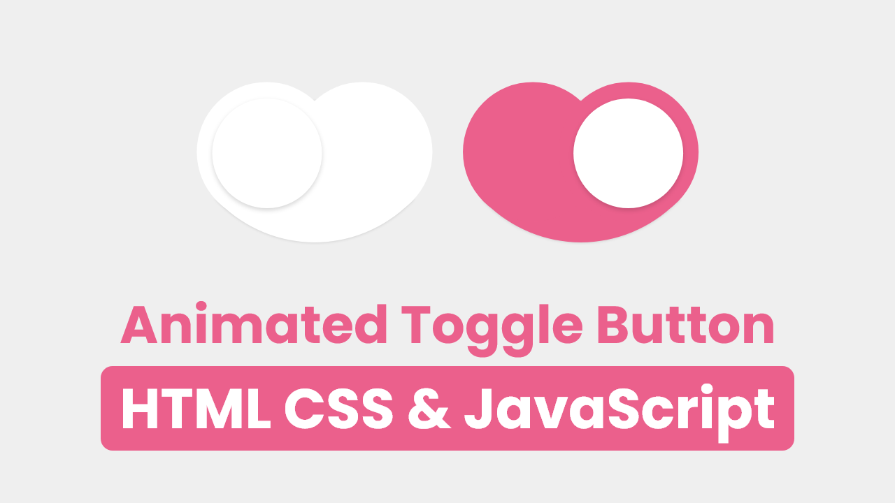
Have a quick look at the given image of our Toggle Button. The toggle button is in a heart shape, inside the heart shape we can see a circle. Actually on the left side toggle button is in off status and the right is in on status. When you click on the toggle button the inner circle moves and at the same time hear color also changes.
Let’s watch the demo of this toggle button, and how it works and is animated. I watched the given video tutorial, you will watch the demo of this toggle button and also all the HTML CSS, and JavaScript code that I have used to create this button.
Video Tutorial Toggle Button HTML CSS & JavaScript
I have provided all the HTML CSS and JavaScript code that I have used to create this toggle button. Before getting into the source code file, I would like to explain the given video tutorial briefly.
As you have seen in the video tutorial. At first, we have seen a toggle button in the heart shape, inside the heart shape there was a circle. When I clicked on the toggle of heart shape the inner circle moved right and the heart color also changed to pink. Same as this when I again clicked on the toggle button the inner circle moved to the left and hear color changed to white. To make the heart shape and inner circle, I have used HTML and CSS, and to move the inner circle and heart’s background color, I have used some JavaScript code.
Now, I believe you can create this type of toggle button using HTML CSS, and JavaScript. If you are feeling difficulty building this, I have provided all the code below.
You Might Like This:
Animate Toggle Button [Source Code]
<!DOCTYPE html>
<!-- Coding By CodingNepal - codingnepalweb.com -->
    <html lang="en">
    <head>
        <meta charset="UTF-8">
        <meta http-equiv="X-UA-Compatible" content="IE=edge">
        <meta name="viewport" content="width=device-width, initial-scale=1.0">
        <title>Animated Toggle Button</title>
        <!-- CSS -->
        <link rel="stylesheet" href="css/style.css">
    </head>
    <body>
        <div class="heart">
            <span class="circle"></span>
        </div>

        <!-- JavaScript -->
     <script>
            const heart = document.querySelector(".heart");

            heart.addEventListener("click", () =>{
            if(!heart.classList.contains("forward")){
                heart.classList.add("forward");
                heart.classList.remove("reverse")
            }else{
                heart.classList.add("reverse")
                heart.classList.remove("forward");

                }
            })

     </script>
    </body>
</html>
*{
  margin: 0;
  padding: 0;
  box-sizing: border-box;
  font-family: 'Poppins', sans-serif;
}
body{
  height: 100vh;
  display: flex;
  align-items: center;
  justify-content: center;
  background-color: #e2e2e2;
}
.heart{
  position: relative;
  height: 70px;
  width: 70px;
  background-color: #fff;
  transform: rotate(-45deg);
  border-bottom-left-radius: 100px;
  box-shadow: 0 0 8px rgba(0, 0, 0, 0.15);
  cursor: pointer;
}
.heart::before{
  content: '';
  position: absolute;
  height: 100%;
  width: 100%;
  top: -50%;
  left: 0;
  border-radius: 50px;
  background-color: #fff;
}
.heart::after{
  content: '';
  position: absolute;
  height: 100%;
  width: 100%;
  top: 0;
  right: -50%;
  border-radius: 50px;
  background-color: #fff;
}
.heart, .heart::before, .heart::after{
  transition: 0.6s;
  transition-delay: 0.3s;
}
.heart.forward,.heart.forward::before,
.heart.forward::after{
  background-color: #eb608c;
}
.circle {
  position: absolute;
  height: 55px;
  width: 55px;
  left: 7px;
  top: -28px;
  border-radius: 50%;
  z-index: 100;
  transition: 0.6s;
  background-color: #fff;
  box-shadow: 0 0 10px rgba(0, 0, 0, 0.15);
}
.heart.forward .circle{
  animation: move 0.6s forwards;
}
@keyframes move {
  0%{
    left: 7px;
    top: -28px;
  }
  50%{
    top: -1px;
    left: 17px;
  }
  100%{
    left: 42px;
    top: 7px;
  }
}

.heart.reverse .circle{
  animation: back1 0.6s forwards;
}
@keyframes back1 {
  0%{
    left: 42px;
    top: 7px;
  }
  50%{
    left: 17px;
    top: 1px;
  }
  100%{
    left: 7px;
    top: -28px;
  }
}


