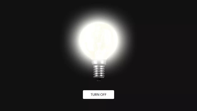
Hello readers, Today in this blog you’ll learn how to create a Glowing Bulb Effect using only HTML & CSS. Earlier I have shared a blog on how to create a Glowing Effect on Social Media Buttons using HTML CSS. And now I’m going to create a glowing effect on the Bulb.
In this program (Glowing Bulb Effect using only HTML & CSS), on the webpage, there is a bulb with a glowing effect and a button also to turn on or off the glowing bulb. This is a pure CSS program that means I used only HTML & CSS to create this glowing effect. To create this effect I used two images of the bulb and swap these images on button click.
If you’re feeling difficult to understand what I am saying. You can watch a full video tutorial on this program (Glowing Bulb Effect using only HTML & CSS).
Video Tutorial of Glowing Bulb Effect using only HTML & CSS
In this video, you have seen the glowing effect of the bulb and I hope you have understood the basic codes behind creating this program. To create this button clickable and change the state of the bulb on click, I used HTML <input type=”checkbox”> and combined with the label. You can also use JavaScript to change the state of the bulb.
If you’re a beginner and you only HTML & CSS then you can also create this type of effect and expand your learning skills so far. If you like this program (Glowing Bulb Effect using only HTML & CSS) and want to get source codes. You can easily get the source codes of this program. To get the source codes you just need to scroll down.
You might like this:
Glowing Bulb Effect using only HTML & CSS [Source Codes]
To create this program (Glowing Bulb Effect using only HTML & CSS). First, you need to create two Files one HTML File and another one is CSS File. After creating these files just paste the following codes in your file.
First, create an HTML file with the name of index.html and paste the given codes in your HTML file. Remember, you’ve to create a file with .html extension and the images that are used on this glowing bulb won’t appear. You’ve to download files from the given download button to use images also.
<!DOCTYPE html>
<!-- Created By CodingNepal -->
<html lang="en" dir="ltr">
  <head>
    <meta charset="utf-8">
    <title>Glowing Bulb Effect | CodingNepal</title>
    <link rel="stylesheet" href="style.css">
  </head>
  <body>
    <div class="wrapper">
      <input type="checkbox" id="btn">
      <img id="bulb-off" src="#">
      <img id="bulb-on" src="#">
      <label for="btn" class="btn">
        <span></span>
      </label>
    </div>
</body>
</html>
Second, create a CSS file with the name of style.css and paste the given codes in your CSS file. Remember, you’ve to create a file with .css extension.
@import url('https://fonts.googleapis.com/css?family=Poppins:400,500,600,700&display=swap');
*{
  margin: 0;
  padding: 0;
  box-sizing: border-box;
  font-family: 'Poppins', sans-serif;
}
body{
  display: flex;
  align-items: center;
  justify-content: center;
  min-height: 100vh;
  background: #111;
}
.wrapper{
  width: 450px;
  height: 500px;
  position: relative;
}
img{
  margin-top: -50px;
  height: 450px;
  width: 100%;
  position: absolute;
}
img#bulb-on{
  opacity: 0;
  animation: glow 3s linear infinite;
}
@keyframes glow {
  0%{
    opacity: 1;
  }
  5%{
    opacity: 1;
  }
  70%{
    opacity: 1;
  }
  74%{
    opacity: 0;
  }
  80%{
    opacity: 1;
  }
  84%{
    opacity: 0;
  }
  90%{
    opacity: 1;
  }
  100%{
    opacity: 1;
  }
}
.btn{
  position: absolute;
  bottom: 0;
  left: 50%;
  transform: translateX(-50%);
}
.btn span{
  height: 50px;
  width: 180px;
  display: block;
  text-align: center;
  line-height: 48px;
  background:none;
  color: #fff;
  text-transform: uppercase;
  font-size: 20px;
  cursor: pointer;
  border: 2px solid #fff;
  border-radius: 5px;
  transition: all 0.3s ease;
}
.btn span:hover{
  background: #fff;
  color: #111;
}
#btn:checked ~ .btn span{
  background: #fff;
  color: #111;
}
.btn span:before{
  content: "Turn Off";
}
#btn:checked ~ img#bulb-on{
  animation: none;
}
#btn:checked ~ .btn span:before{
  content: "Turn on";
}
.wrapper input{
  display: none;
}
That’s all, now you’ve successfully created a Glowing Bulb Effect using only HTML & CSS. If your code doesn’t work or you’ve faced any error/problem then please download the source code files from the given download button. It’s free and a .zip file will be downloaded then you’ve to extract it.


