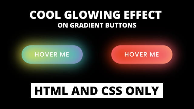
Hello readers, Today in this blog you’ll learn how to create Cool Glowing Effects on Buttons using only HTML & CSS. Previously I have shared how to create a Shining Hover Effect on Buttons using HTML CSS, now it’s time to create a Glowing Effects on CSS Buttons.
CSS buttons refer to styled HTML buttons that developers customize to match their website designs. You can manipulate the colors, text sizes, padding, and even change styling properties when buttons enter different states.
As you can see in the image, there are two buttons with a glowing effect. These buttons are based on only HTML & CSS. Simply, to create this glow effect I moved two or more colors smoothly with some blur effects.
If you’re feeling difficult to understand what I am saying. You can watch a full video tutorial on this program (Cool Glowing Effect on Buttons).
Video Tutorial of Cool Glowing Effect on CSS Buttons
I believe you like this program (Cool Glowing Effect on Buttons) and its shining hover effect. If you like this Glow effect on the button and want to get codes of this program. You can easily get the source codes of this program. To get the source codes you just need to scroll down.
If you are a beginner and have some basic knowledge about HTML & CSS then definitely you can also create these types of glowing effects on buttons. You can use these buttons on your websites, projects, and wherever you want.
Glowing Effect on Buttons in HTML & CSS [Source Codes]
To create this program (Cool Glowing Effect on Buttons). First, you need to create two Files one HTML File and another one is CSS File. After creating these files just paste the following codes in your file. First, create an HTML file with the name of index.html and paste the given codes in your HTML file. Remember, you’ve to create a file with .html extension.
<!DOCTYPE html>
<!-- Created By CodingNepal -->
<html lang="en" dir="ltr">
  <head>
    <meta charset="utf-8">
    <title>Glowing CSS Buttons | CodingNepal</title>
    <link rel="stylesheet" href="style.css">
  </head>
  <body>
    <div class="buttons">
      <button>Hover Me</button>
      <button>Hover Me</button>
    </div>
</body>
</html>
Second, create a CSS file with the name of style.css and paste the given codes in your CSS file. Remember, you’ve to create a file with .css extension.
@import url('https://fonts.googleapis.com/css?family=Poppins:400,500,600,700&display=swap');
*{
  margin: 0;
  padding: 0;
  box-sizing: border-box;
  font-family: 'Poppins', sans-serif;
}
html,body{
  display: grid;
  height: 100%;
  place-items: center;
  background: #000;
  overflow: hidden;
}
button{
  position: relative;
  height: 60px;
  width: 200px;
  margin: 0 35px;
  border-radius: 50px;
  border: none;
  outline: none;
  background: #111;
  color: #fff;
  font-size: 20px;
  font-weight: 500;
  letter-spacing: 2px;
  text-transform: uppercase;
  cursor: pointer;
  transition: background 0.5s;
}
button:first-child:hover{
  background: linear-gradient(90deg, #03a9f4, #f441a5, #ffeb3b, #03a9f4);
  background-size: 400%;
}
button:last-child:hover{
  background: linear-gradient(90deg, #fa7199, #f5ce62, #e43603, #fa7199);
  background-size: 400%;
}
button:first-child:before,
button:last-child:before{
  content: '';
  position: absolute;
  background: inherit;
  top: -5px;
  right: -5px;
  bottom: -5px;
  left: -5px;
  border-radius: 50px;
  filter: blur(20px);
  opacity: 0;
  transition: opacity 0.5s;
}
button:first-child:hover:before,
button:last-child:hover:before{
  opacity: 1;
  z-index: -1;
}
button:hover{
  z-index: 1;
  animation: glow 8s linear infinite;
}
@keyframes glow {
  0%{
    background-position: 0%;
  }
  100%{
    background-position: 400%;
  }
}
That’s all, now you’ve successfully created a Cool Glowing Effect on Buttons using HTML & CSS. If your code does not work or you’ve faced any error/problem then please comment down or contact us from the contact page.


