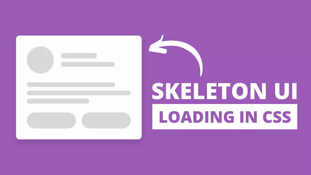
 Hello readers, Today in this blog you’ll learn how to create Skeleton Loading Screen Animation using only HTML & CSS. Earlier I have shared a blog on how to create a drag and drop list or draggable list in javascript and now it’s time to create skeleton loading screen animation.
A skeleton loading screen is the user interface (UI) that doesn’t hold actual content; instead, it animates the page’s layout by showing its elements in shape similar to the actual content as it is loading and becoming ready.
In this program [Skeleton Loading Screen Animation], on the webpage, there is showing skeleton loader by its element shape. This is a pure CSS program, so this skeleton screen doesn’t load actual content but you can easily show your content by removing this skeleton layer when the content loaded completely. If you’re feeling difficult to understand what I am saying. You can watch a full video tutorial on this program [Skeleton Loading Screen Animation].
Video Tutorial of Skeleton Loading Screen Animation
In the video, you have seen the skeleton ui loading screen which is created using only HTML & CSS. I hope you’ve understood the codes and concepts behind creating this program. If you’re a beginner then you can also create this type of loading screen because it’s easy to create using CSS.
You might like this:
Skeleton Loading Screen Animation [Source Codes]
To create this program (Skeleton Loader). First, you need to create two Files one HTML File and another one is CSS File. After creating these files just paste the following codes into your file. First, create an HTML file with the name of index.html and paste the given codes in your HTML file. Remember, you’ve to create a file with .html extension.
<!DOCTYPE html>
<!-- Created By CodingNepal - www.codingnepalweb.com -->
<html lang="en">
<head>
    <meta charset="UTF-8">
    <meta name="viewport" content="width=device-width, initial-scale=1.0">
    <title>Skeleton Loading Animation | CodingNepal</title>
    <link rel="stylesheet" href="style.css">
</head>
<body>
  <div class="card">
    <div class="header">
      <div class="img"></div>
      <div class="details">
        <span class="name"></span>
        <span class="about"></span>
      </div>
    </div>
    <div class="description">
      <div class="line line-1"></div>
      <div class="line line-2"></div>
      <div class="line line-3"></div>
    </div>
    <div class="btns">
      <div class="btn btn-1"></div>
      <div class="btn btn-2"></div>
    </div>
  </div>
</body>
</html>
Second, create a CSS file with the name of style.css and paste the given codes in your CSS file. Remember, you’ve to create a file with .css extension.
*{
  margin: 0;
  padding: 0;
  box-sizing: border-box;
}
body{
  display: flex;
  align-items: center;
  justify-content: center;
  min-height: 100vh;
}
.card{
  max-width: 350px;
  width: 100%;
  background: #fff;
  padding: 30px;
  border-radius: 10px;
  border: 1px solid #d9d9d9;
}
.card .header{
  display: flex;
  align-items: center;
}
.header .img{
  height: 75px;
  width: 75px;
  background: #d9d9d9;
  border-radius: 50%;
  position: relative;
  overflow: hidden;
}
.header .details{
  margin-left: 20px;
}
.details span{
  display: block;
  background: #d9d9d9;
  border-radius: 10px;
  overflow: hidden;
  position: relative;
}
.details .name{
  height: 15px;
  width: 100px;
}
.details .about{
  height: 13px;
  width: 150px;
  margin-top: 10px;
}
.card .description{
  margin: 25px 0;
}
.description .line{
  background: #d9d9d9;
  border-radius: 10px;
  height: 13px;
  margin: 10px 0;
  overflow: hidden;
  position: relative;
}
.description .line-1{
  width: calc(100% - 15%);
}
.description .line-3{
  width: calc(100% - 40%);
}
.card .btns{
  display: flex;
}
.card .btns .btn{
  height: 45px;
  width: 100%;
  background: #d9d9d9;
  border-radius: 25px;
  position: relative;
  overflow: hidden;
}
.btns .btn-1{
  margin-right: 8px;
}
.btns .btn-2{
  margin-left: 8px;
}
.header .img::before,
.details span::before,
.description .line::before,
.btns .btn::before{
  position: absolute;
  content: "";
  height: 100%;
  width: 100%;
  background-image: linear-gradient(to right, #d9d9d9 0%, rgba(0,0,0,0.05) 20%, #d9d9d9 40%, #d9d9d9 100%);
  background-repeat: no-repeat;
  background-size: 450px 400px;
  animation: shimmer 1s linear infinite;
}
.header .img::before{
  background-size: 650px 600px;
}
.details span::before{
  animation-delay: 0.2s;
}
.btns .btn-2::before{
  animation-delay: 0.22s;
}
@keyframes shimmer {
  0%{
    background-position: -450px 0;
  }
  100%{
    background-position: 450px 0;
  }
}
That’s all, now you’ve successfully created a Skeleton Loading Screen Animation using only HTML & CSS. If your does code not work or you’ve faced any error/problem then please download the source code files from the given download button. It’s free and a .zip file will be downloaded then you’ve to extract it.


