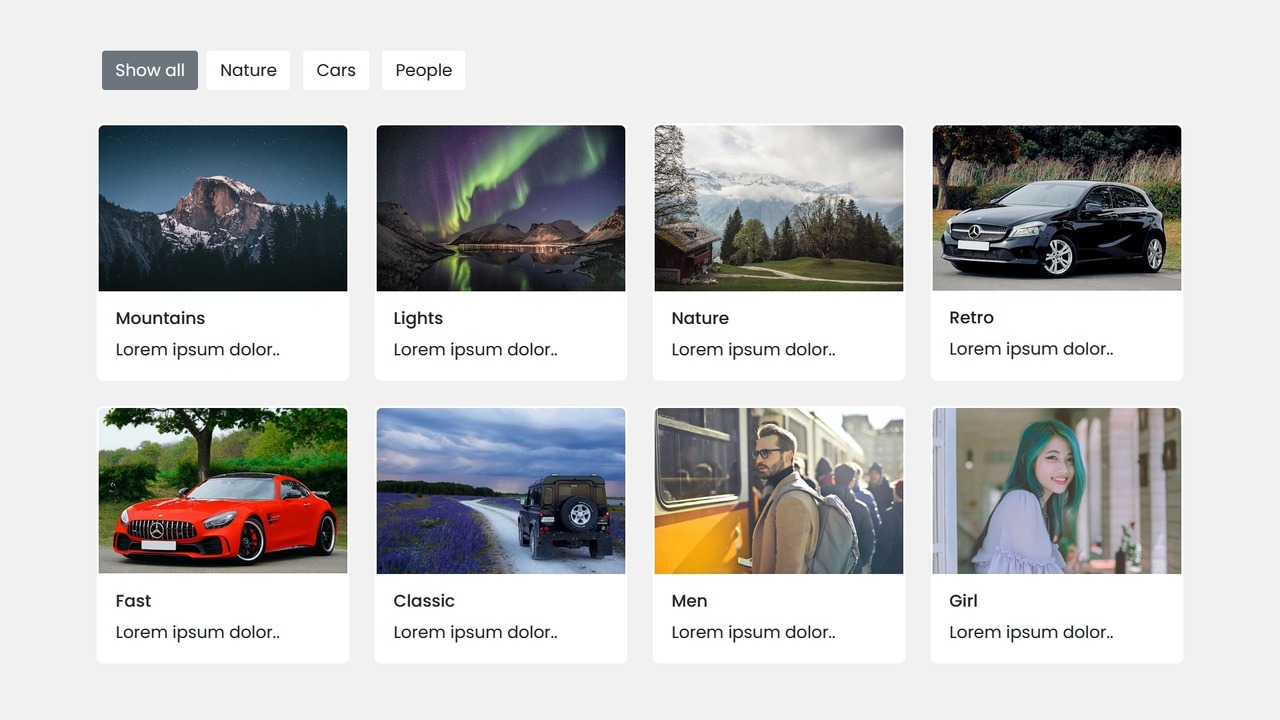
A filterable image gallery is a type of image gallery that allows users to filter or sort the displayed images based on certain categories or tags. This is one of the essential elements on today’s website, as it allows users to easily find the images they are interested in without having to scroll through a long list of images.
Creating a filterable image gallery using HTML, Bootstrap, and JavaScript can greatly enhance your web development skills. With Bootstrap, a popular front-end framework, you can easily create responsive website elements that adapt to different screen sizes and devices.
The purpose of this blog post is to provide you with a comprehensive guide on how to create a filterable image gallery using these three essential technologies: HTML, Bootstrap, and JavaScript. The step-by-step instructions and clear explanations in this post will help you to develop a practical understanding of the process involved in building a filterable image gallery.
Steps for a Filterable Image Gallery in Bootstrap and JavaScript
To create a responsive, filterable image gallery in HTML, Bootstrap and JavaScript, follow the given steps line by line:
- Create a folder. You can name this folder whatever you want, and inside this folder, create the mentioned files.
- Create an
index.htmlfile. The file name must be index and its extension .html - Create a
style.cssfile. The file name must be style and its extension .css - Create a
script.jsfile. The file name must be script and its extension .js - Download the images folder from Google Drive and put this folder inside the project folder.
To start, add the following HTML codes to your index.html file to create a basic layout for the image gallery and filter tabs.
<!DOCTYPE html>
<!-- Website - www.codingnepalweb.com -->
<html lang="en" dir="ltr">
  <head>
    <meta charset="utf-8">
    <title>Filterable Image Gallery Bootstrap | CodingNepal</title>
    <link rel="stylesheet" href="style.css">
    <meta name="viewport" content="width=device-width, initial-scale=1.0">
    <link rel="stylesheet" href="https://cdn.jsdelivr.net/npm/bootstrap@5.3.0-alpha2/dist/css/bootstrap.min.css">
    <script src="script.js" defer></script>
  </head>
  <body>
    <div class="container">
      <!-- Images Filter Buttons Section -->
      <div class="row mt-5" id="filter-buttons">
        <div class="col-12">
          <button class="btn mb-2 me-1 active" data-filter="all">Show all</button>
          <button class="btn mb-2 mx-1" data-filter="nature">Nature</button>
          <button class="btn mb-2 mx-1" data-filter="cars">Cars</button>
          <button class="btn mb-2 mx-1" data-filter="people">People</button>
        </div>
      </div>

      <!-- Filterable Images / Cards Section -->
      <div class="row px-2 mt-4 gap-3" id="filterable-cards">
        <div class="card p-0" data-name="nature">
          <img src="images/nature-1.jpg" alt="img">
          <div class="card-body">
            <h6 class="card-title">Mountains</h6>
            <p class="card-text">Lorem ipsum dolor..</p>
          </div>
        </div>
        <div class="card p-0" data-name="nature">
          <img src="images/nature-2.jpg" alt="img">
          <div class="card-body">
            <h6 class="card-title">Lights</h6>
            <p class="card-text">Lorem ipsum dolor..</p>
          </div>
        </div>
        <div class="card p-0" data-name="nature">
          <img src="images/nature-3.jpg" alt="img">
          <div class="card-body">
            <h6 class="card-title">Nature</h6>
            <p class="card-text">Lorem ipsum dolor..</p>
          </div>
        </div>
        <div class="card p-0" data-name="cars">
          <img src="images/car-1.jpg" alt="img">
          <div class="card-body">
            <h6 class="card-title">Retro</h6>
            <p class="card-text">Lorem ipsum dolor..</p>
          </div>
        </div>
        <div class="card p-0" data-name="cars">
          <img src="images/car-2.jpg" alt="img">
          <div class="card-body">
            <h6 class="card-title">Fast</h6>
            <p class="card-text">Lorem ipsum dolor..</p>
          </div>
        </div>
        <div class="card p-0" data-name="cars">
          <img src="images/car-3.jpg" alt="img">
          <div class="card-body">
            <h6 class="card-title">Classic</h6>
            <p class="card-text">Lorem ipsum dolor..</p>
          </div>
        </div>
        <div class="card p-0" data-name="people">
          <img src="images/people-1.jpg" alt="img">
          <div class="card-body">
            <h6 class="card-title">Men</h6>
            <p class="card-text">Lorem ipsum dolor..</p>
          </div>
        </div>
        <div class="card p-0" data-name="people">
          <img src="images/people-2.jpg" alt="img">
          <div class="card-body">
            <h6 class="card-title">Girl</h6>
            <p class="card-text">Lorem ipsum dolor..</p>
          </div>
        </div>
      </div>
    </div>

  </body>
</html>
Next, add the following CSS codes to your style.css file to style the image gallery and make it interactive and beautiful. Since we’ve used Bootstrap, we don’t need to write more CSS.
/* Import Google font - Poppins */
@import url('https://fonts.googleapis.com/css2?family=Poppins:wght@400;500;600&display=swap');

* {
  font-family: "Poppins", sans-serif;
}

body {
  background: #f1f1f1 !important;
}

body .container {
  max-width: 1100px;
}

#filter-buttons button {
  border-radius: 3px;
  background: #fff;
  border-color: transparent;
}

#filter-buttons button:hover {
  background: #ddd;
}

#filter-buttons button.active {
  color: #fff;
  background: #6c757d;
}

#filterable-cards .card {
  width: 15rem;
  border: 2px solid transparent;
}

#filterable-cards .card.hide {
  display: none;
}

@media (max-width: 600px) {
  #filterable-cards {
    justify-content: center;
  }

  #filterable-cards .card {
    width: calc(100% / 2 - 10px);
  }
}
Finally, add the following JavaScript code to your script.js file to make the image gallery filterable when the user clicks on a specific filter tab.
// Select relevant HTML elements
const filterButtons = document.querySelectorAll("#filter-buttons button");
const filterableCards = document.querySelectorAll("#filterable-cards .card");

// Function to filter cards based on filter buttons
const filterCards = (e) => {
    document.querySelector("#filter-buttons .active").classList.remove("active");
    e.target.classList.add("active");

    filterableCards.forEach(card => {
        // show the card if it matches the clicked filter or show all cards if "all" filter is clicked
        if(card.dataset.name === e.target.dataset.filter || e.target.dataset.filter === "all") {
            return card.classList.replace("hide", "show");
        }
        card.classList.add("hide");
    });
}

filterButtons.forEach(button => button.addEventListener("click", filterCards));
Conclusion and Final Words
I hope this blog post has provided you with the necessary knowledge to build your own filterable image gallery using HTML, Bootstrap, and JavaScript. The coding process was designed to be both intuitive and easy to understand, allowing you to tailor your gallery to your specific needs.
However, if you’re interested in exploring a pure CSS, HTML, and JavaScript approach, I recommend checking out my blog on creating a Responsive Filterable Image Gallery using these technologies. This will provide you with an alternative approach to achieving the same goal, and allow you to expand your web development skillset even further.
In case you face any issues or your code is not performing as intended, you can access the source code files for this filterable image gallery at no cost. Simply click on the download button to get the zip file that contains the project folder with all the necessary source code files and images.


