The search bar has become the most important section on the website or application. You must have used it to search for information on YouTube, Google, Facebook, and other sites. Although Search Box is the most important section for the website or application even then it can be created easily by using basic code of HTML & CSS.
Today in this blog you will learn to Create a Responsive Search Bar in HTML & CSS. Even if you have basic knowledge of HTML & CSS, then also you can create a Search Bar. Recently I created a Simple Website in HTML & CSS, I hope that project also could be beneficial for you.
The search bar is the input section where users have to type what they want to search. For example, In Google, if we have to search or find articles, websites, images, and videos then we need to use the search bar.
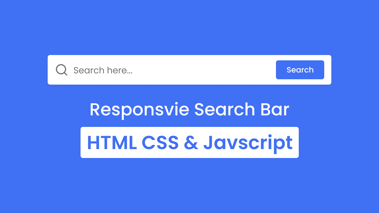
Take a look at the given preview of our Search Box that we are going to create today. As you can see in the image, there is a search bar with a long width. At that Search Bar, there is a search icon, search field, and search button. This Search Bar is fully responsive and easily get fits any size of screen device.
To see the real demo of this Search Box and all the HTML & CSS code that I have used to create this Responsive and Full-Screen Search Bar, I have provided a video tutorial.
Create Search Bar in HTML & CSS | Video Tutorial
I have also provided all the HTML & CSS code that I have used to create this Responsive Search Bar. Before getting into the source code file, I would like to briefly explain the given video tutorial of the Search Box.
As you have seen in the video tutorial. At first, on the screen, there was a Full-Screen Search Bar with an input field, a search icon, and a beautiful. You may have got to know that this search bar actually can be created with HTML and CSS code. To give click animation on the button I had to use some JavaScript code.
I believe now you are able to create a Search Box. If you are feeling difficulty and wondering to get all the HTML CSS and JavaScript code of this Search Bar that I have used then, you can take all the source code from below.
You May Like This:
- Simple Search Bar HTML CSS
- Sidebar with Search Bar in HTML CSS & JS
- Navigation Bar with Search Bar in HTML CSS & JS
Search Bar in HTML & CSS [Source Code]
- Create a folder. You can name this folder whatever you want, and inside this folder, create the mentioned files.
- Create an
index.htmlfile. The file name must be index and its extension .html - Create a
style.cssfile. The file name must be style and its extension .css
Once you create these files, paste the given codes into the specified files. If you don’t want to do these then scroll down and download the Responsive Search Bar by clicking on the given download button.
First, paste the following codes into your index.html file.
<!DOCTYPE html>
<!-- Coding By CodingNepal - codingnepalweb.com -->
<html lang="en">
  <head>
    <meta charset="UTF-8" />
    <meta http-equiv="X-UA-Compatible" content="IE=edge" />
    <meta name="viewport" content="width=device-width, initial-scale=1.0" />
   <title>Search Bar in HTML and CSS</title>
    <!-- CSS -->
    <link rel="stylesheet" href="style.css" />
    <!-- Unicons CSS -->
    <link rel="stylesheet" href="https://unicons.iconscout.com/release/v4.0.0/css/line.css" />
  </head>
  <body>
    <div class="input-box">
      <i class="uil uil-search"></i>
      <input type="text" placeholder="Search here..." />
      <button class="button">Search</button>
    </div>
  </body>
</html>
Second, paste the following codes into your style.css file.
/* Google Fonts - Poppins */
@import url("https://fonts.googleapis.com/css2?family=Poppins:wght@300;400;500;600&display=swap");

* {
  margin: 0;
  padding: 0;
  box-sizing: border-box;
  font-family: "Poppins", sans-serif;
}
body {
  min-height: 100vh;
  display: flex;
  align-items: center;
  justify-content: center;
  background: #4070f4;
}
.input-box {
  position: relative;
  height: 76px;
  max-width: 900px;
  width: 100%;
  background: #fff;
  margin: 0 20px;
  border-radius: 8px;
  box-shadow: 0 5px 10px rgba(0, 0, 0, 0.1);
}
.input-box i,
.input-box .button {
  position: absolute;
  top: 50%;
  transform: translateY(-50%);
}
.input-box i {
  left: 20px;
  font-size: 30px;
  color: #707070;
}
.input-box input {
  height: 100%;
  width: 100%;
  outline: none;
  font-size: 18px;
  font-weight: 400;
  border: none;
  padding: 0 155px 0 65px;
  background-color: transparent;
}
.input-box .button {
  right: 20px;
  font-size: 16px;
  font-weight: 400;
  color: #fff;
  border: none;
  padding: 12px 30px;
  border-radius: 6px;
  background-color: #4070f4;
  cursor: pointer;
}
.input-box .button:active {
  transform: translateY(-50%) scale(0.98);
}

/* Responsive */
@media screen and (max-width: 500px) {
  .input-box {
    height: 66px;
    margin: 0 8px;
  }
  .input-box i {
    left: 12px;
    font-size: 25px;
  }
  .input-box input {
    padding: 0 112px 0 50px;
  }
  .input-box .button {
    right: 12px;
    font-size: 14px;
    padding: 8px 18px;
  }
}
That’s all, now you’ve successfully created a project on the Responsive Search Bar. If your code doesn’t work or you’ve faced any problems, please download the source code files from the given download button. It’s free and a zip file containing the project folder with source code files will be downloaded.


