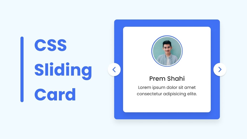
Designing and building a card slider that adjusts to different screen sizes using HTML & CSS can be a valuable project for improving your coding abilities. Additionally, working on a responsive card slider project will provide you with a hands-on understanding of how to apply responsive design principles and techniques in real-world scenarios.
A card slider is a user interface element that allows users to scroll through a collection of items, such as images, text, or other content, in a visually appealing and interactive way. These items are usually arranged in the form of cards, which can be scrolled through horizontally or vertically.
In this blog post, you will learn how to design and build a card slider that adjusts to different screen sizes using HTML and CSS. The card slider will have a user interface similar to the one shown in the image, and it can be scrolled horizontally or vertically. We can also create Card Slider using Swiperjs as well, I hope that project will also be beneficial for you.
Video Tutorial of Card Slider in HTML & CSS
If you would like to create a Card Slider step by step, I would highly recommend you a video tutorial that is provided below. Alternatively, you could continue reading this written guide on the same topic.
Steps to Card Slider in HTML & CSS
1. File Structure
2. Creating the Card Slider
In the second step, we will create the layout and style the card using HTML and CSS. In your index.html file, add the following HTML code to create the basic structure of the card slider.
<!DOCTYPE html>
<!-- Coding By CodingNepal - codingnepalweb.com -->
<html lang="en">
  <head>
    <meta charset="UTF-8" />
    <meta http-equiv="X-UA-Compatible" content="IE=edge" />
    <meta name="viewport" content="width=device-width, initial-scale=1.0" />
    <title>Card Slider in HTML & CSS</title>
    <link rel="stylesheet" href="style.css" />
  </head>
  <body>
    <section class="container">
      <div class="card">
        <div class="image">
          <img src="images/img1.jpg" alt="" />
        </div>
        <h2>Someone Name</h2>
        <p>Lorem ipsum dolor sit amet consectetur adipisicing elite.</p>
      </div>
      <div class="card">
        <div class="image">
         <img src="images/img2.jpg" alt="" />
        </div>
        <h2>Someone Name</h2>
        <p>Lorem ipsum dolor sit amet consectetur adipisicing elite.</p>
      </div>
      <div class="card">
        <div class="image">
          <img src="images/img3.jpg" alt="" />
        </div>
        <h2>Someone Name</h2>
        <p>Lorem ipsum dolor sit amet consectetur adipisicing elite.</p>
      </div>
      <div class="card">
        <div class="image">
          <img src="images/img4.jpg" alt="" />
        </div>
        <h2>Someone Name</h2>
        <p>Lorem ipsum dolor sit amet consectetur adipisicing elite.</p>
      </div>
    </section>
  </body>
</html>
In your style.css file, add the following CSS code to style the card slider. If you want, you can change the font, size, color, and background of the notification by slightly modifying this code.
/* Import Google font - Poppins */
@import url("https://fonts.googleapis.com/css2?family=Poppins:wght@200;300;400;500;600;700&display=swap");
* {
  margin: 0;
  padding: 0;
  box-sizing: border-box;
  font-family: "Poppins", sans-serif;
}
body {
  min-height: 100vh;
  display: flex;
  align-items: center;
  justify-content: center;
  background: #e3f2fd;
}
::-webkit-scrollbar {
  height: 8px;
}
::-webkit-scrollbar-track {
  background: #f1f1f1;
  border-radius: 25px;
}
::-webkit-scrollbar-thumb {
  background: #6e93f7;
  border-radius: 25px;
}
::-webkit-scrollbar-thumb:hover {
  background: #4070f4;
}
.container {
  display: flex;
  gap: 12px;
  max-width: 400px;
  width: 100%;
  background: #4070f4;
  border-radius: 12px;
  padding: 30px;
  scroll-snap-type: x mandatory;
  overflow-x: scroll;
  scroll-padding: 30px;
  box-shadow: 0 15px 25px rgba(0, 0, 0, 0.1);
}
.container .card {
  display: flex;
  flex: 0 0 100%;
  flex-direction: column;
  align-items: center;
  padding: 30px;
  border-radius: 12px;
  background: #fff;
  scroll-snap-align: start;
  box-shadow: 0 15px 25px rgba(0, 0, 0, 0.1);
}
.card .image {
  height: 150px;
  width: 150px;
  padding: 4px;
  background: #4070f4;
  border-radius: 50%;
}
.image img {
  height: 100%;
  width: 100%;
  object-fit: cover;
  border-radius: 50%;
  border: 5px solid #fff;
}
.card h2 {
  margin-top: 25px;
  color: #333;
  font-size: 22px;
  font-weight: 600;
}
.card p {
  margin-top: 4px;
  font-size: 18px;
  font-weight: 400;
  color: #333;
  text-align: center;
}
Conclusion and Final Words
By following the steps in this blog post, you’ve learned how to create Responsive Card Slider in HTML and CSS.
If you encounter any problems or your code is not working as expected, you can download the source code files of this Card Slider by clicking on the given download button. It’s free, and a zip file will be downloaded that contains the project folder with source code files.


