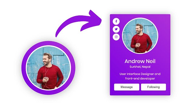
Hello readers, Today in this blog you’ll learn how to create an Animated Profile Card with Hover Animation using HTML CSS & JavaScript. Earlier I have shared a blog about how to create Responsive Profile Cards using only HTML & CSS. Now it’s time to create Hover Animation on Card.
What is a card, exactly? Well, they come in all sorts of shapes and sizes, but common cards will include information or content such as a title, a user name, a picture, and various icons. Sometimes there might be a brief amount of text, for example, product or client description.
Today in this video, I’ll share with you this program (Profile Card UI Design with Hover Animation). At first, on the webpage, there is only an image with round border color. But when you hover on that card, then the height and width of the card smoothly expand and show the contents of the card. I have also added transition-delay on social media buttons so the buttons will appear one by one.
If you’re feeling difficulty understanding what I am saying. You can watch a full video tutorial on this program (Profile Card UI Design with Hover Animation).
Video Tutorial of the Card Hover Animation
As you have seen the real animation of the card in the video as well you have seen when we click on the image, the image converts into full screen. There I used JavaScript to create that image clickable and convert it into full screen.
If you’re a beginner and you know HTML & CSS, then you can also create this type of card and add creative hover animation and effect. If you like this program (Profile Card UI Design with Hover Animation) and want to get source codes. You can easily get the source codes of this program. To get the source codes you just need to scroll down.
You might like this:
Animated Profile Card UI Design [Source Codes]
To create this program (Profile Card UI Design with Hover Animation). First, you need to create two Files one HTML File and another one is CSS File. After creating these files just paste the following codes in your file. First, create an HTML file with the name of index.html and paste the given codes in your HTML file. Remember, you’ve to create a file with .html extension.
<!DOCTYPE html>
<!-- Created By CodingNepal -->
<html lang="en" dir="ltr">
   <head>
      <meta charset="utf-8">
      <title>Profile Card Hover Animation | CodingNepal</title>
      <link rel="stylesheet" href="style.css">
      <link rel="stylesheet" href="https://cdnjs.cloudflare.com/ajax/libs/font-awesome/5.15.3/css/all.min.css"/>
   </head>
   <body>
      <div class="container">
         <div class="wrapper">
            <a href="#">
            <img src="#" alt="">
            </a>
            <div class="title">
               Andrew Neil
            </div>
            <div class="place">
               Surkhet, Nepal
            </div>
         </div>
         <div class="content">
            <p>
               User Interface Designer and <br>front-end developer
            </p>
            <div class="buttons">
               <div class="btn">
                  <button>Message</button>
               </div>
               <div class="btn">
                  <button>Following</button>
               </div>
            </div>
         </div>
         <div class="icons">
            <li><a href="#"><span class="fab fa-facebook-f"></span></a></li>
            <li><a href="#"><span class="fab fa-twitter"></span></a></li>
            <li><a href="#"><span class="fab fa-instagram"></span></a></li>
         </div>
      </div>
      <script>
         const img = document.querySelector("img");
         const icons = document.querySelector(".icons");
         img.onclick = function(){
           this.classList.toggle("active");
           icons.classList.toggle("active");
         }
      </script>
   </body>
</html>
Second, create a CSS file with the name of style.css and paste the given codes in your CSS file. Remember, you’ve to create a file with .css extension.
@import url('https://fonts.googleapis.com/css?family=Poppins:400,500,600,700&display=swap');
body{
  margin: 0;
  padding: 0;
  box-sizing: border-box;
  font-family: 'Poppins',sans-serif;
  padding: 50px;
  text-align: center;
}
.container{
  height: 250px;
  width: 250px;
  overflow: hidden;
  margin: 0 auto;
  border-radius: 50%;
  transition: all 0.3s ease-in-out;
  box-shadow: 0px 1px 5px 0px rgba(0,0,0,0.3);
  background: linear-gradient(45deg, #7b00e0, #ae31d9);
}
.container:hover{
  height: 470px;
  width: 350px;
  border-radius: 5px;
  box-shadow: 0px 1px 35px 0px rgba(0,0,0,0.3);
}
.container .wrapper img{
  position: relative;
  z-index: 20;
  border-radius: 50%;
  display: block;
  height: 200px;
  width: 200px;
  border: 5px solid #fff;
  object-fit: cover;
  margin: 20px auto;
  transition: all 0.3s ease;
}
.container:hover .wrapper img.active{
  height: 470px;
  width: 350px;
  margin: 0px auto;
  border: none;
  border-radius: 5px;
}
.wrapper .title{
  color: #fff;
  font-size: 30px;
  font-weight: 500;
  padding: 10px;
  line-height: 25px;
}
.wrapper .place{
  color: #fff;
  font-size: 17px;
  line-height: 0px;
  margin: 10px 0;
}
.content{
  color: #fff;
  font-size: 17px;
  margin-top: 10px;
  padding: 1px 20px 10px 20px!important;
}
.content .buttons{
  display: flex;
}
.buttons .btn{
  height: 40px;
  width: 150px;
  margin: 0 5px;
}
.buttons .btn button{
  height: 100%;
  width: 100%;
  background: #fff;
  border: none;
  outline: none;
  cursor: pointer;
  font-size: 17px;
  font-weight: 500;
  border-radius: 5px;
  transition: all 0.3s;
}
.btn button:hover{
  transform: scale(0.95);
}
.container .icons{
  position: relative;
  margin-top: -435px;
  margin-left: 10px;
  list-style: none;
}
.container .icons.active{
  display: none;
}
.container .icons li{
  height: 40px;
  width: 40px;
  margin: 5px 0;
  opacity: 0;
  margin-left: -100px;
  transition: all 0.5s ease;
}
.container:hover .icons li{
  opacity: 1;
  margin-left: 7px;
}
.container:hover .icons li:nth-child(2){
  transition-delay: 0.2s;
}
.container:hover .icons li:nth-child(3){
  transition-delay: 0.4s;
}
.container .icons li a{
  color: #7b00e0;
  height: 100%;
  width: 100%;
  border-radius: 50%;
  background: #fff;
  display: block;
  line-height: 40px;
  transition: all 0.3s;
}
.container .icons li a:hover{
  transform: scale(0.9);
}
That’s all, now you’ve successfully created a Profile Card with Hover Animation in HTML CSS & JavaScript. If your code doesn’t work or you’ve faced any error/problem then please comment down or contact us from the contact page.


