Hello readers, Today in this blog you’ll learn how to create Responsive Cards with Hover Effect in HTML & CSS only. Previously I have shared a Working Calculator using HTML CSS & Javascript, now it’s time to create a Responsive Cards Design using HTML CSS.
Maybe you know what is a card on the website. If you don’t know about this, Often cards are used to organize listings of blog posts, products, services, etc. Section with border and content and take margin from another one they are cards.
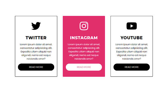
As you can see in the image, this is a pure CSS card with a hover effect. you can see there are three cards, icons, buttons, and some dummy texts. These cards are fully responsive with the help of the CSS @media property. To create these Cards, I used simple and easy HTML CSS codes which help the beginner to understand easily.
If you’re feeling difficult to understand what I am saying. You can watch a full video tutorial on this program (Pure CSS Responsive Cards Design with Hover Effect).
Video Tutorial of Responsive CSS Cards with Hover Effect
I hope you have understood the basic concepts and codes from the video. As you have seen in the video these cards are fully responsive to mobile devices also. When you open these cards on your mobile devices, it will automatically adjust their width and height according to the height and width of the device.
If you like this program (Pure CSS Responsive Cards Design with Hover Effect) and their hover effect and want to get the source codes of these cards. You can easily get it from the download link which is given below.
You might like this:
Responsive Cards with Hover Effect [Source Codes]
To create this program (Pure CSS Responsive Cards Design with Hover Effect). First, you need to create two Files one HTML File and another one is CSS File. After creating these files just paste the following codes in your file.
First, create an HTML file with the name of index.html and paste the given codes in your HTML file. Remember, you’ve to create a file with .html extension.
<!DOCTYPE html>
<!-- Created By CodingNepal -->
<html lang="en" dir="ltr">
   <head>
      <meta charset="utf-8">
      <!-- <title>Responsive Cards</title> -->
      <link rel="stylesheet" href="style.css">
      <link rel="stylesheet" href="https://cdnjs.cloudflare.com/ajax/libs/font-awesome/5.15.3/css/all.min.css"/>
      <meta name="viewport" content="width=device-width, initial-scale=1.0">
   </head>
   <body>
      <div class="cards">
         <h2 class="header">
            Responsive Cards CSS
         </h2>
         <div class="services">
            <div class="content content-1">
               <div class="fab fa-twitter"></div>
               <h2>
                  Twitter
               </h2>
               <p>
                  Lorem ipsum dolor sit amet, consectetur adipisicing elit. Expedita ullam aliquid non eligendi, nemo est neque reiciendis error?
               </p>
               <a href="#">Read More</a>
            </div>
            <div class="content content-2">
               <div class="fab fa-instagram"></div>
               <h2>
                  Instagram
               </h2>
               <p>
                  Lorem ipsum dolor sit amet, consectetur adipisicing elit. Expedita ullam aliquid non eligendi, nemo est neque reiciendis error?
               </p>
               <a href="#">Read More</a>
            </div>
            <div class="content content-3">
               <div class="fab fa-youtube"></div>
               <h2>
                  Youtube
               </h2>
               <p>
                  Lorem ipsum dolor sit amet, consectetur adipisicing elit. Expedita ullam aliquid non eligendi, nemo est neque reiciendis error?
               </p>
               <a href="#">Read More</a>
            </div>
         </div>
      </div>
   </body>
</html>
Second, create a CSS file with the name of style.css and paste the given codes in your CSS file. Remember, you’ve to create a file with .css extension.
@import url('https://fonts.googleapis.com/css?family=Montserrat:400,800|Poppins&display=swap');
*{
  margin: 0;
  padding: 0;
  box-sizing: border-box;
  font-family: 'Montserrat',sans-serif;
}
.cards{
  max-width: 1100px;
  margin: 0 auto;
  text-align: center;
  padding: 30px;
}
.cards h2.header{
  font-size: 40px;
  margin: 0 0 30px 0;
  text-transform: uppercase;
  letter-spacing: 1px;
}
.services{
  display: flex;
  align-items: center;
}
.content{
  display: flex;
  flex-wrap: wrap;
  flex: 1;
  margin: 20px;
  padding: 20px;
  border: 2px solid black;
  border-radius: 4px;
  transition: all .3s ease;
}
.content .fab{
  font-size: 70px;
  margin: 16px 0;
}
.content > *{
  flex: 1 1 100%;
}
.content:hover{
  color: white;
}
.content:hover a{
  border-color: white;
  background: white;
}
.content-1:hover{
  border-color: #1DA1F2;
  background: #1DA1F2;
}
.content-1:hover a{
  color: #1DA1F2;
}
.content-2:hover{
  border-color: #E1306C;
  background: #E1306C;
}
.content-2:hover a{
  color: #E1306C;
}
.content-3:hover{
  border-color: #ff0000;
  background: #ff0000;
}
.content-3:hover a{
  color: #ff0000;
}
.content h2{
  font-size: 30px;
  margin: 16px 0;
  letter-spacing: 1px;
  text-transform: uppercase;
}
.content p{
  font-size: 17px;
  font-family: 'Poppins',sans-serif;
}
.content a{
  margin: 22px 0;
  background: black;
  color: white;
  text-decoration: none;
  text-transform: uppercase;
  border: 1px solid black;
  padding: 15px 0;
  border-radius: 25px;
  transition: .3s ease;
}
.content a:hover{
  border-radius: 4px;
}
@media (max-width: 900px) {
  .services{
    display: flex;
    flex-direction: column;
  }
}
That’s all, now you’ve successfully created a Pure CSS Responsive Cards Design with Hover Effect. If your does code not work or you’ve faced any error/problem then please comment down or contact us from the contact page.


