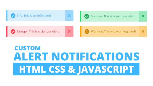
Hello readers, Today in this blog you’ll learn how to create a Custom Warning Alert Notification using HTML CSS & JavaScript. Earlier I shared a blog on how to create an Animated Modal Box Design using HTML & CSS. And now I’m going to create an Alert Notification.
A notification is a message, email, icon, or other symbol that appear when an application wants you to pay attention. The notifications are a method to let you know that something new has happened.
In this Custom Warning Alert Notification, at first, on the webpage, there is only a button, but when you click on that button, the alert notification appears in the right-top corner. This notification hides automatically after five seconds, and there is also a cross-sign button to hide that notification.
If you’re feeling difficult to understand what I am saying. You can watch a full video tutorial on this program (Custom Warning Alert Notification).
Video Tutorial of Custom Warning Alert Notification
In the video, you have seen how this notification appears and I hope you have understood the basic codes behind creating this alert notification. This notification is simple without any advanced JavaScript codes. If you know HTML CSS & JavaScript then you can customize this program and use it on your websites, projects, and HTML pages.
If you like this program (Custom Warning Alert Notification) and want to get source codes. You can easily get the source codes of this program. To get the source codes you just need to scroll down.
You might like this:
Custom Warning Alert Notification [Source Codes]
To create this program (Custom Warning Alert Notification). First, you need to create two Files one HTML File and another one is CSS File. After creating these files just paste the following codes into your file.
First, create an HTML file with the name index.html and paste the given codes into your HTML file. Remember, you’ve to create a file with .html extension.
<!DOCTYPE html>
<!-- Created By CodingNepal -->
<html lang="en" dir="ltr">
   <head>
      <meta charset="utf-8">
      <title>Warning Alert Notification | CodingNepal</title>
      <link rel="stylesheet" href="style.css">
      <link rel="stylesheet" href="https://cdnjs.cloudflare.com/ajax/libs/font-awesome/5.15.3/css/all.min.css"/>
      <script src="https://code.jquery.com/jquery-3.4.1.js"></script>
   </head>
   <body>
      <button>Show Alert</button>
      <div class="alert hide">
         <span class="fas fa-exclamation-circle"></span>
         <span class="msg">Warning: This is a warning alert!</span>
         <div class="close-btn">
            <span class="fas fa-times"></span>
         </div>
      </div>
      <script>
         $('button').click(function(){
           $('.alert').addClass("show");
           $('.alert').removeClass("hide");
           $('.alert').addClass("showAlert");
           setTimeout(function(){
             $('.alert').removeClass("show");
             $('.alert').addClass("hide");
           },5000);
         });
         $('.close-btn').click(function(){
           $('.alert').removeClass("show");
           $('.alert').addClass("hide");
         });
      </script>
   </body>
</html>
Second, create a CSS file with the name style.css and paste the given codes into your CSS file. Remember, you’ve to create a file with .css extension.
@import url('https://fonts.googleapis.com/css?family=Poppins:400,500,600,700&display=swap');
*{
  margin: 0;
  padding: 0;
  user-select: none;
  box-sizing: border-box;
  font-family: 'Poppins', sans-serif;
}
html,body{
  height: 100%;
}
body{
  display: grid;
  place-items: center;
  overflow: hidden;
}
button{
  padding: 8px 16px;
  font-size: 25px;
  font-weight: 500;
  border-radius: 4px;
  border: none;
  outline: none;
  background: #e69100;
  color: white;
  letter-spacing: 1px;
  cursor: pointer;
}
.alert{
  background: #ffdb9b;
  padding: 20px 40px;
  min-width: 420px;
  position: absolute;
  right: 0;
  top: 10px;
  border-radius: 4px;
  border-left: 8px solid #ffa502;
  overflow: hidden;
  opacity: 0;
  pointer-events: none;
}
.alert.showAlert{
  opacity: 1;
  pointer-events: auto;
}
.alert.show{
  animation: show_slide 1s ease forwards;
}
@keyframes show_slide {
  0%{
    transform: translateX(100%);
  }
  40%{
    transform: translateX(-10%);
  }
  80%{
    transform: translateX(0%);
  }
  100%{
    transform: translateX(-10px);
  }
}
.alert.hide{
  animation: hide_slide 1s ease forwards;
}
@keyframes hide_slide {
  0%{
    transform: translateX(-10px);
  }
  40%{
    transform: translateX(0%);
  }
  80%{
    transform: translateX(-10%);
  }
  100%{
    transform: translateX(100%);
  }
}
.alert .fa-exclamation-circle{
  position: absolute;
  left: 20px;
  top: 50%;
  transform: translateY(-50%);
  color: #ce8500;
  font-size: 30px;
}
.alert .msg{
  padding: 0 20px;
  font-size: 18px;
  color: #ce8500;
}
.alert .close-btn{
  position: absolute;
  right: 0px;
  top: 50%;
  transform: translateY(-50%);
  background: #ffd080;
  padding: 20px 18px;
  cursor: pointer;
}
.alert .close-btn:hover{
  background: #ffc766;
}
.alert .close-btn .fas{
  color: #ce8500;
  font-size: 22px;
  line-height: 40px;
}
That’s all, now you’ve successfully created a Custom Warning Alert Notification using HTML CSS & JavaScript. If your code doesn’t work or you’ve faced any error/problem then please comment down or contact us from the contact page.


