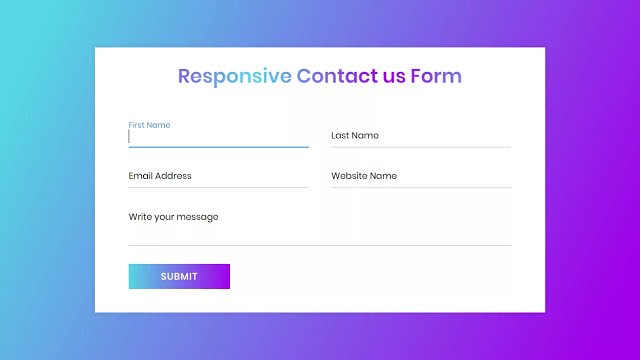
Hello readers, Today in this blog you’ll learn how to create a Responsive Contact us Form using only HTML & CSS. Earlier I have shared a blog on how to create an Animated Login Form Design. And now I’m going to create a Fully Responsive Contact us Form using CSS Flexbox.
A contact form used to allow visitors to a website to contact the owner of the site or people who are responsible for its maintenance. A contact form with records where the visitor can fill in their name, subject and message and send or reset it.
In this program (Responsive Contact us Form), on the webpage, there is a linear gradient background and a contact us form. In each input field, there is a focus animation. This contacts us form is fully responsive to any device (Tablet, Mobile, PC). This form changes their field according to the device width that means on the mobile version, these form fields will be aligned vertically and on tablet and PC, this form field is aligned horizontally.
If you’re feeling difficult to understand what I am saying. You can watch a full video tutorial on this program (Responsive Contact us Form).
Video Tutorial of Responsive Contact us Form Design
In the video, you have the responsive version of this program and I hope you love this as well as have understood the basic codes behind creating this form. As you already know on video, This form is created only for design purposes. So on this form, there is no action and this form won’t submit your entered details anywhere.
If you know JavaScript, then you can add some JavaScript codes and take this contact us form at the next level. And if you know backend languages like PHP/MySQL, then you can connect this form with the database. If you like this program (Responsive Contact us Form) and want to get source codes.
You might like this:
Responsive Contact us Form [Source Codes]
To create this program (Responsive Contact us Form). First, you need to create two Files one HTML File and another one is CSS File. After creating these files just paste the following codes in your file.
First, create an HTML file with the name of index.html and paste the given codes in your HTML file. Remember, you’ve to create a file with .html extension.
<!DOCTYPE html>
<!-- Created By CodingNepal -->
<html lang="en" dir="ltr">
   <head>
      <meta charset="utf-8">
      <title>Responsive Contact us Form | CodingNepal</title>
      <link rel="stylesheet" href="style.css">
      <meta name="viewport" content="width=device-width, initial-scale=1.0">
   </head>
   <body>
    <div class="container">
        <div class="text">Responsive Contact us Form</div>
        <form action="#">
           <div class="form-row">
              <div class="input-data">
                 <input type="text" required>
                 <div class="underline"></div>
                 <label for="">First Name</label>
              </div>
              <div class="input-data">
                 <input type="text" required>
                 <div class="underline"></div>
                 <label for="">Last Name</label>
              </div>
           </div>
           <div class="form-row">
              <div class="input-data">
                 <input type="text" required>
                 <div class="underline"></div>
                 <label for="">Email Address</label>
              </div>
              <div class="input-data">
                 <input type="text" required>
                 <div class="underline"></div>
                 <label for="">Website Name</label>
              </div>
           </div>
           <div class="form-row">
              <div class="input-data textarea">
                 <textarea rows="8" cols="80" required></textarea>
                 <br />
                 <div class="underline"></div>
                 <label for="">Write your message</label>
                 <br />
                 <div class="form-row submit-btn">
                    <div class="input-data">
                       <div class="inner"></div>
                       <input type="submit" value="submit">
                    </div>
                 </div>
              </div>
           </div>
        </form>
     </div>
   </body>
</html>
Second, create a CSS file with the name of style.css and paste the given codes in your CSS file. Remember, you’ve to create a file with .css extension.
@import url('https://fonts.googleapis.com/css?family=Poppins:400,500,600,700&display=swap');
*{
  margin: 0;
  padding: 0;
  outline: none;
  box-sizing: border-box;
  font-family: 'Poppins', sans-serif;
}
body{
  display: flex;
  align-items: center;
  justify-content: center;
  min-height: 100vh;
  padding: 40px;
  background: linear-gradient(115deg, #56d8e4 10%, #9f01ea 90%);
}
.container{
  max-width: 800px;
  background: #fff;
  width: 800px;
  padding: 25px 40px 10px 40px;
  box-shadow: 0px 0px 10px rgba(0,0,0,0.1);
}
.container .text{
  text-align: center;
  font-size: 35px;
  font-weight: 600;
  background: -webkit-linear-gradient(right, #56d8e4, #9f01ea, #56d8e4, #9f01ea);
  -webkit-background-clip: text;
  -webkit-text-fill-color: transparent;
}
.container form{
  padding: 30px 0 0 0;
}
.container form .form-row{
  display: flex;
  margin: 32px 0;
}
form .form-row .input-data{
  width: 100%;
  height: 40px;
  margin: 0 20px;
  position: relative;
}
form .form-row .textarea{
  height: 70px;
}
.input-data input,
.textarea textarea{
  display: block;
  width: 100%;
  height: 100%;
  border: none;
  font-size: 17px;
  border-bottom: 2px solid rgba(0,0,0, 0.12);
}
.input-data input:focus ~ label, .textarea textarea:focus ~ label,
.input-data input:valid ~ label, .textarea textarea:valid ~ label{
  transform: translateY(-20px);
  font-size: 14px;
  color: #3498db;
}
.textarea textarea{
  resize: none;
  padding-top: 10px;
}
.input-data label{
  position: absolute;
  pointer-events: none;
  bottom: 10px;
  font-size: 16px;
  transition: all 0.3s ease;
}
.textarea label{
  width: 100%;
  bottom: 40px;
  background: #fff;
}
.input-data .underline{
  position: absolute;
  bottom: 0;
  height: 2px;
  width: 100%;
}
.input-data .underline:before{
  position: absolute;
  content: "";
  height: 2px;
  width: 100%;
  background: #3498db;
  transform: scaleX(0);
  transform-origin: center;
  transition: transform 0.3s ease;
}
.input-data input:focus ~ .underline:before,
.input-data input:valid ~ .underline:before,
.textarea textarea:focus ~ .underline:before,
.textarea textarea:valid ~ .underline:before{
  transform: scale(1);
}
.submit-btn .input-data{
  overflow: hidden;
  height: 45px!important;
  width: 25%!important;
}
.submit-btn .input-data .inner{
  height: 100%;
  width: 300%;
  position: absolute;
  left: -100%;
  background: -webkit-linear-gradient(right, #56d8e4, #9f01ea, #56d8e4, #9f01ea);
  transition: all 0.4s;
}
.submit-btn .input-data:hover .inner{
  left: 0;
}
.submit-btn .input-data input{
  background: none;
  border: none;
  color: #fff;
  font-size: 17px;
  font-weight: 500;
  text-transform: uppercase;
  letter-spacing: 1px;
  cursor: pointer;
  position: relative;
  z-index: 2;
}
@media (max-width: 700px) {
  .container .text{
    font-size: 30px;
  }
  .container form{
    padding: 10px 0 0 0;
  }
  .container form .form-row{
    display: block;
  }
  form .form-row .input-data{
    margin: 35px 0!important;
  }
  .submit-btn .input-data{
    width: 40%!important;
  }
}
That’s all, now you’ve successfully created a Responsive Contact us Form using HTML & CSS. If your code doesn’t work or you’ve faced any error/problem then please comment down or contact us from the contact page.


