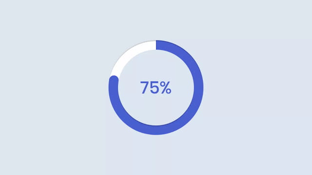
Hello readers, Today in this blog you’ll learn how to create an Animated Circular Progress Bar using HTML CSS & JavaScript. Earlier I have shared a blog on how to create an Animated Gradient Shiny Loader. And now I’m going to create a circular progress bar with a percentage.
The Circular Progress Bar component lets you show the progress of a specific operation, using, as a progress bar, a circular SVG pattern. Changing the stroke-dash offset and stroke-dash array values of the second shape creates the fill effect.
In this program (Circular Progress Bar), at first, on the webpage, this circular progress bar is in the initial stage where there is no circle animation and the percentage of this bar is also stops at 0%. And when you refresh the browser then the circular bar creates the color fill effect and the percentage of this bar is also starts increasing. When it completed 100%, the fill effect stops filling as well the percent number also stops increasing.
If you’re feeling difficult to understand what I am saying. You can watch a full video tutorial on this program (Circular Progress Bar).
Video Tutorial of Circular Progress Bar with the Percentage
In the video, you have seen the animation and effect of this circular bar and I hope you have understood the basic codes behind creating this program. The color fill effect of this circular bar is totally based on CSS that means using the only CSS I created the fill animation of this program. But I used JavaScript for increasing the percent number to 100%.
If you have a little bit of knowledge of JavaScript, then you can easily understand the JavaScript codes of this program and as you know CSS is too easy to understand and the color fills effect of this program is based on CSS only. If you like this program (Circular Progress Bar) and want to get source codes. You can easily get the source codes of this program. To get the source codes you just need to scroll down.
You might like this:
Circular Progress Bar with Percent [Source Codes]
To create this program (Circular Progress Bar). First, you need to create two Files one HTML File and another one is CSS File. After creating these files just paste the following codes in your file.
First, create an HTML file with the name of index.html and paste the given codes in your HTML file. Remember, you’ve to create a file with .html extension.
<!DOCTYPE html>
<!-- Created By CodingNepal -->
<html lang="en" dir="ltr">
   <html lang="en" dir="ltr">
      <head>
         <meta charset="utf-8">
         <title>Circular Progress Bar | CodingNepal</title>
         <link rel="stylesheet" href="style.css">
      </head>
      <body>
         <div class="circular">
            <div class="inner"></div>
            <div class="outer"></div>
            <div class="numb">
               0%
            </div>
            <div class="circle">
               <div class="dot">
                  <span></span>
               </div>
               <div class="bar left">
                  <div class="progress"></div>
               </div>
               <div class="bar right">
                  <div class="progress"></div>
               </div>
            </div>
         </div>
         <script>
            const numb = document.querySelector(".numb");
            let counter = 0;
            setInterval(()=>{
              if(counter == 100){
                clearInterval();
              }else{
                counter+=1;
                numb.textContent = counter + "%";
              }
            }, 80);
         </script>
    </body>
</html>
Second, create a CSS file with the name of style.css and paste the given codes in your CSS file. Remember, you’ve to create a file with .css extension.
@import url('https://fonts.googleapis.com/css?family=Poppins:400,500,600,700&display=swap');
*{
  margin: 0;
  padding: 0;
  box-sizing: border-box;
  font-family: 'Poppins', sans-serif;
}
html,body{
  display: grid;
  height: 100%;
  text-align: center;
  place-items: center;
  background: #dde6f0;
}
.circular{
  height: 100px;
  width: 100px;
  position: relative;
}
.circular .inner, .circular .outer, .circular .circle{
  position: absolute;
  z-index: 6;
  height: 100%;
  width: 100%;
  border-radius: 100%;
  box-shadow: inset 0 1px 0 rgba(0,0,0,0.2);
}
.circular .inner{
  top: 50%;
  left: 50%;
  height: 80px;
  width: 80px;
  margin: -40px 0 0 -40px;
  background-color: #dde6f0;
  border-radius: 100%;
  box-shadow: 0 1px 0 rgba(0,0,0,0.2);
}
.circular .circle{
  z-index: 1;
  box-shadow: none;
}
.circular .numb{
  position: absolute;
  top: 50%;
  left: 50%;
  transform: translate(-50%, -50%);
  z-index: 10;
  font-size: 18px;
  font-weight: 500;
  color: #4158d0;
}
.circular .bar{
  position: absolute;
  height: 100%;
  width: 100%;
  background: #fff;
  -webkit-border-radius: 100%;
  clip: rect(0px, 100px, 100px, 50px);
}
.circle .bar .progress{
  position: absolute;
  height: 100%;
  width: 100%;
  -webkit-border-radius: 100%;
  clip: rect(0px, 50px, 100px, 0px);
}
.circle .bar .progress, .dot span{
  background: #4158d0;
}
.circle .left .progress{
  z-index: 1;
  animation: left 4s linear both;
}
@keyframes left {
  100%{
    transform: rotate(180deg);
  }
}
.circle .right{
  z-index: 3;
  transform: rotate(180deg);
}
.circle .right .progress{
  animation: right 4s linear both;
  animation-delay: 4s;
}
@keyframes right {
  100%{
    transform: rotate(180deg);
  }
}
.circle .dot{
  z-index: 2;
  position: absolute;
  left: 50%;
  top: 50%;
  width: 50%;
  height: 10px;
  margin-top: -5px;
  animation: dot 8s linear both;
  transform-origin: 0% 50%;
}
.circle .dot span {
  position: absolute;
  right: 0;
  width: 10px;
  height: 10px;
  border-radius: 100%;
}
@keyframes dot{
  0% {
    transform: rotate(-90deg);
  }
  50% {
    transform: rotate(90deg);
    z-index: 4;
  }
  100% {
    transform: rotate(270deg);
    z-index: 4;
  }
}
That’s all, now you’ve successfully created a Circular Progress Bar using HTML CSS & JavaScript. If your code doesn’t work or you’ve faced any error/problem then please comment down or contact us from the contact page.


