Hello readers, Today in this blog you’ll learn how to create an Animated Blog Card Slider using only HTML & CSS. Earlier I have shared a blog on how to create Responsive Cards Design in HTML & CSS. And now I’m going to create a Blog Card Slider. This slide animation is fully based on HTML CSS.
Blog or Image sliders (also known as image carousels or slideshows) can be an easy way to display multiple images, videos, or graphics on your website. The idea of a big, beautiful, flashy image shows can be quite alluring. Compelling images can bring new visitors into your site, capturing their attention instantly.
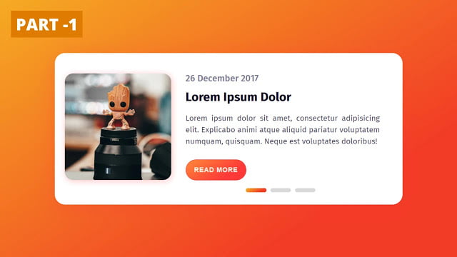
In this program (Animated Slider Blog Card), at first, on the webpage, there is a gradient background with the white container box. And this box there is an image on the left side and some texts, a button, and slider controls on the bottom side. These sliders are used to slide the preview cards. There are three different cards with a different image and when you click on the slider button each card slides smoothly and shown another card.
If you’re feeling difficult to understand what I am saying. You can watch a full video tutorial on this program (Animated Slider Blog Card).
Video Tutorial of Animated Blog Card Slider
As you have seen the sliding animation of this program in the video and I hope you liked this program and understood the basic codes behind creating this program. This is a pure CSS program that means only HTML & CSS are used to create this slider. There are no vast codes used to create this program. So if you know HTML & CSS then you can also create this type of slider.
You can use this program on your websites, projects, and HTML pages. Nowadays, every website has its card or image slideshow to display products, multiple images, videos, or graphics on their website. If you like this program (Animated Slider Blog Card) and want to get source codes. You can easily get the source codes of this program. To get the source codes you just need to scroll down.
You might like this:
Animated Slider Blog Card [Source Codes]
To create this program (Animated Slider Blog Card). First, you need to create two Files one HTML File and another one is CSS File. After creating these files just paste the following codes in your file.
First, create an HTML file with the name of index.html and paste the given codes in your HTML file. Remember, you’ve to create a file with .html extension.
<!DOCTYPE html>
<!-- Created By CodingNepal -->
<html lang="en" dir="ltr">
   <head>
      <meta charset="utf-8">
      <title>Slider Blog Card</title>
      <link rel="stylesheet" href="style.css">
   </head>
   <body>
      <div class="blog-card">
         <input type="radio" name="select" id="tap-1" checked>
         <input type="radio" name="select" id="tap-2">
         <input type="radio" name="select" id="tap-3">
         <input type="checkbox" id="imgTap">
         <div class="sliders">
            <label for="tap-1" class="tap tap-1"></label>
            <label for="tap-2" class="tap tap-2"></label>
            <label for="tap-3" class="tap tap-3"></label>
         </div>
         <div class="inner-part">
            <label for="imgTap" class="img">
            <img class="img-1" src="#">
            </label>
            <div class="content content-1">
               <span>26 December 2017</span>
               <div class="title">
                  Lorem Ipsum Dolor
               </div>
               <div class="text">
                  Lorem ipsum dolor sit amet, consectetur adipisicing elit. Explicabo animi atque aliquid pariatur voluptatem numquam, quisquam. Neque est voluptates doloribus!
               </div>
               <button>Read more</button>
            </div>
         </div>
         <div class="inner-part">
            <label for="imgTap" class="img">
            <img class="img-2" src="#">
            </label>
            <div class="content content-2">
               <span>26 December 2018</span>
               <div class="title">
                  Lorem Ipsum Dolor
               </div>
               <div class="text">
                  Lorem ipsum dolor sit amet, consectetur adipisicing elit. Ipsum eos ut consectetur numquam ullam fuga animi laudantium nobis rem molestias.
               </div>
               <button>Read more</button>
            </div>
         </div>
         <div class="inner-part">
            <label for="imgTap" class="img">
            <img class="img-3" src="#">
            </label>
            <div class="content content-3">
               <span>26 December 2019</span>
               <div class="title">
                  Lorem Ipsum Dolor
               </div>
               <div class="text">
                  Lorem ipsum dolor sit amet, consectetur adipisicing elit. Quod excepturi nemo commodi sint eum ipsam odit atque aliquam officia impedit.
               </div>
               <button>Read more</button>
            </div>
         </div>
      </div>
   </body>
</html>
Second, create a CSS file with the name of style.css and paste the given codes in your CSS file. Remember, you’ve to create a file with .css extension.
@import url("https://fonts.googleapis.com/css?family=Fira+Sans:400,500,600,700,800");
*{
  margin: 0;
  padding: 0;
  box-sizing: border-box;
}
body{
  display: flex;
  align-items: center;
  justify-content: center;
  height: 100vh;
  font-family: 'Fira Sans', sans-serif;
  background: linear-gradient(147deg,#f6b323 0%, #f23b26 74%);
}
.blog-card{
  position: absolute;
  height: 370px;
  width: 95%;
  max-width: 850px;
  margin: auto;
  border-radius: 25px;
  background: white;
  box-shadow: 0px 10px 50px rgba(252,56,56,.3);
}
.inner-part{
  position: absolute;
  display: flex;
  height: 360px;
  align-items: center;
  justify-content: center;
  padding: 0 25px;
}
#imgTap:checked ~ .inner-part {
  padding: 0;
  transition: .1s ease-in;
}
.inner-part .img{
  height: 260px;
  width: 260px;
  flex-shrink: 0;
  overflow: hidden;
  border-radius: 20px;
  box-shadow: 2px 3px 15px rgba(252,56,56,.1);
}
#imgTap:checked ~ .inner-part .img{
  height: 370px;
  width: 850px;
  z-index: 99;
  margin-top: 10px;
  transition: .3s .2s ease-in;
}
.img img{
  height: 100%;
  width: 100%;
  object-fit: cover;
  cursor: pointer;
  opacity: 0;
  transition: .6s;
}
#tap-1:checked ~ .inner-part .img-1,
#tap-2:checked ~ .inner-part .img-2,
#tap-3:checked ~ .inner-part .img-3{
  opacity: 1;
  transition-delay: .2s;
}
.content{
  padding: 0 20px 0 35px;
  width: 530px;
  margin-left: 50px;
  opacity: 0;
  transition: .6s;
}
#imgTap:checked ~ .inner-part .content{
  display: none;
}
#tap-1:checked ~ .inner-part .content-1,
#tap-2:checked ~ .inner-part .content-2,
#tap-3:checked ~ .inner-part .content-3{
  opacity: 1;
  margin-left: 0px;
  z-index: 100;
  transition-delay: .3s;
}
.content span{
  display: block;
  color: #7b7992;
  margin-bottom: 15px;
  font-size: 22px;
  font-weight: 500
}
.content .title{
  font-size: 30px;
  font-weight: 700;
  color: #0d0925;
  margin-bottom: 20px;
}
.content .text{
  color: #4e4a67;
  font-size: 19px;
  margin-bottom: 30px;
  line-height: 1.5em;
  text-align: justify;
}
.content button{
  display: inline-flex;
  padding: 15px 20px;
  border: none;
  font-size: 16px;
  text-transform: uppercase;
  color: #fff0e6;
  font-weight: 600;
  letter-spacing: 1px;
  border-radius: 50px;
  cursor: pointer;
  outline: none;
  border: 1px solid #fd3535;
  background: linear-gradient(147deg, #fe8a39  0%, #fd3838 74%);
}
.content button:hover{
  background: linear-gradient(147deg, #fe791b 0%, #fd1c1c 74%);
}
.sliders{
  position: absolute;
  bottom: 25px;
  left: 65%;
  transform: translateX(-50%);
  z-index: 12;
}
#imgTap:checked ~ .sliders{
  display: none;
}
.sliders .tap{
  position: relative;
  height: 10px;
  width: 50px;
  background: #d9d9d9;
  border-radius: 5px;
  display: inline-flex;
  margin: 0 3px;
  cursor: pointer;
}
.sliders .tap:hover{
  background: #cccccc;
}
.sliders .tap:before{
  position: absolute;
  content: '';
  top: 0;
  left: 0;
  height: 100%;
  width: -100%;
  background: linear-gradient(147deg,#f6b323 0%, #f23b26 74%);
  border-radius: 10px;
  transform: scaleX(0);
  transition: transform .6s;
  transform-origin: left;
}
input[type="radio"],
input[type="checkbox"]{
  display: none;
}
#tap-1:checked ~ .sliders .tap-1:before,
#tap-2:checked ~ .sliders .tap-2:before,
#tap-3:checked ~ .sliders .tap-3:before{
  transform: scaleX(1);
  width: 100%;
}
That’s all, now you’ve successfully created an Animated Slider Blog Card using HTML & CSS. If your code doesn’t work or you’ve faced any error/problem then please download the source code files from the given download button. It’s free and a .zip file will be downloaded then you’ve to extract it.


