Hello buddy, I hope you are doing and creating mind-blowing projects using HTML, CSS, and JavaScript. Today on this blog, you are going to learn how to make a toggle button with dark and light modes using HTML, CSS, and JavaScript. I have also used local storage to keep the selected mode while we refresh the page or reopen the file. Earlier I have made a Simple Toggle Button, I hope you have liked it.
A toggle button is the type of button used to turn on or off. The dark and light modes are the color appearance of the page. We can see on many webpages and apps that they use this type of toggle button. For example, on Windows, we can see this button in the wifi section, where we use this toggle button to turn on or off the wifi.
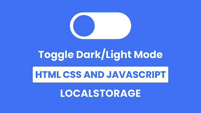
Have a look at the given image of our project [Toggle Button Dark Light Mode]. As you can see in the image, there is a toggle button in close or off status because the blue circle is on the left side. Similarly, our background is also in blue, so this is our light mode. When we click on the toggle section, the blue circle moves to the right side and its color and background color change into dark mode, which will be called dark mode.
For the demo of this project and all the HTML, CSS, and JavaScript code that I have used to create this project [Toggle Button Dark Light Mode ], watch the given video tutorial. After watching the given video tutorial, you will get an idea of how all the HTML, CSS, and JavaScript codes are working behind this project.
Toggle Button Dark Light Mode in JavaScript | LocatStorage
I have provided all the HTML CSS & JavaScript code that I have used to create this project [Toggle Button with Dark Light Mode], but before getting into the source code, I would be delighted to berifly explain the given video tutorial.
As you have seen on the video tutorial [Toggle Button with Dark Light Mode]. At first, there was a toggle button with blue circle with white background on it, similarly the full wepage color was also blue. When I clicked on the toggle button the toggle’s circle moves to right side and it’s color also changed into dark, similarly the background of the body was also changed into dark with a beautiful animation.
I had refreshed the page and reopened that file in an another tab but the selected mode did not change to make this I used localstorage and the UI design of the toggle button is made by HTML and CS, to toggle that button I used some JavaScript code.
Now I believe that you can create this type of toggle button and also the dark and light mode by using HTML CSS and JavaScript. If you are feeling difficult to build this project [Toggle Button with Dark Light Mode], I have provided all the HTML CSS and JavaScript code below.
You May Like This:
- Navigation with Tabbar
- Button Ripple Animaton
- Heart Shape Toggle Button
- Button with Loading Animation
Toggle Button with Dark Light Mode [Source Code]
<!DOCTYPE html>
<!-- Coding By CodingNepal - codingnepalweb.com -->
<html lang="en">
  <head>
    <meta charset="UTF-8" />
    <meta http-equiv="X-UA-Compatible" content="IE=edge" />
    <meta name="viewport" content="width=device-width, initial-scale=1.0" />
   <title>Toggle Button with Dark/Light Mode</title>
    <!-- CSS -->
    <link rel="stylesheet" href="css/style.css" />
  </head>
  <body>
    <div class="toggle"></div>

    <!-- JavaScript -->
    <script>
      const body = document.querySelector("body"),
        toggle = document.querySelector(".toggle");

      let getMode = localStorage.getItem("mode");
      if (getMode && getMode === "dark") {
        body.classList.add("dark");
        toggle.classList.add("active");
      }

      toggle.addEventListener("click", () => {
        body.classList.toggle("dark");

        if (!body.classList.contains("dark")) {
          return localStorage.setItem("mode", "light");
        }
        localStorage.setItem("mode", "dark");
      });

      toggle.addEventListener("click", () => toggle.classList.toggle("active"));
    </script>
  </body>
</html>
* {
  margin: 0;
  padding: 0;
  box-sizing: border-box;
}
body {
  height: 100vh;
  display: flex;
  align-items: center;
  justify-content: center;
  background-color: #4070f4;
  transition: all 0.3s ease-in-out;
}
body.dark {
  background-color: #18191a;
}
.toggle {
  position: relative;
  height: 130px;
  width: 300px;
  border-radius: 100px;
  background-color: #fff;
  box-shadow: 0 5px 10px rgba(0, 0, 0, 0.1);
  cursor: pointer;
}
.toggle::before {
  content: "";
  position: absolute;
  height: 110px;
  width: 110px;
  background: #4070f4;
  border-radius: 50%;
  top: 50%;
  left: 14px;
  transform: translateY(-50%);
  transition: all 0.3s ease-in-out;
}
.toggle.active::before {
  background-color: #18191a;
  left: calc(100% - 110px - 14px);
}ont-family: 'Poppins', sans-serif;
}
If you face any difficulties while creating your Toggle Button or your code is not working as expected, you can download the source code files for this Toggle Button for free by clicking on the download button, and you can also view a live demo of this card slider by clicking on the view live button.


