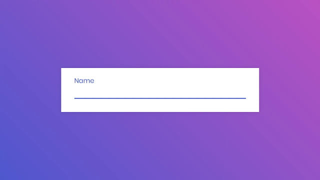
Hello readers, Today in this blog you’ll learn how to create an Awesome Input Animation or Floating Label Animation using only HTML & CSS. Earlier I have shared a blog on how to create Popup Login Form Design in HTML & CSS. And now I’m going to create an Input Animation.
As you have seen on many websites, when you click on the input field to enter some info there is an awesome floating label animation. A floating label is a text label that appears inside the input field at full font size. When interacted with, the label “floats” above, making space or room for the user to input value or log-in details.
Today I’ll share with you this program (Floating Label Animation or Input Animation). In this program, there is an input animation also that means when you click on the input field there is a smooth border animation that starts from the center and expands to the left and right side.
If you’re feeling difficulty understanding what I am saying. You can watch a full video tutorial on this program (Floating Label Animation or Input Animation).
Video Tutorial of Floating Label Animation or Input Animation
In the video, you have seen Input Animation with Floating Label Animation. I hope you like this design. If you’re a beginner and you know HTML & CSS then you can also create this type of animation and use it on your websites and projects. You can easily get the source codes of this program. To get the source codes you just need to scroll down.
You might like this:
Floating Label Animation or Input Animation [Source Codes]
To create this program (Floating Label Animation or Input Animation). First, you need to create two Files one HTML File and another one is CSS File. After creating these files just paste the following codes in your file. First, create an HTML file with the name of index.html and paste the given codes in your HTML file. Remember, you’ve to create a file with .html extension.
<!DOCTYPE html>
<!-- Created By CodingNepal -->
<html lang="en" dir="ltr">
   <head>
      <meta charset="utf-8">
      <title>Input Animation | CodingNepal</title>
      <link rel="stylesheet" href="style.css">
   </head>
   <body>
      <div class="wrapper">
         <div class="input-data">
            <input type="text" required>
            <div class="underline"></div>
            <label>Name</label>
         </div>
      </div>
   </body>
</html>
Second, create a CSS file with the name of style.css and paste the given codes in your CSS file. Remember, you’ve to create a file with .css extension.
@import url('https://fonts.googleapis.com/css?family=Poppins:400,500,600,700&display=swap');
*{
  margin: 0;
  padding: 0;
  outline: none;
  box-sizing: border-box;
  font-family: 'Poppins', sans-serif;
}
body{
  display: flex;
  align-items: center;
  justify-content: center;
  min-height: 100vh;
  background: linear-gradient(-135deg, #c850c0, #4158d0);
}
.wrapper{
  width: 450px;
  background: #fff;
  padding: 30px;
  box-shadow: 0px 0px 10px rgba(0,0,0,0.1);
}
.wrapper .input-data{
  height: 40px;
  width: 100%;
  position: relative;
}
.wrapper .input-data input{
  height: 100%;
  width: 100%;
  border: none;
  font-size: 17px;
  border-bottom: 2px solid silver;
}
.input-data input:focus ~ label,
.input-data input:valid ~ label{
  transform: translateY(-20px);
  font-size: 15px;
  color: #4158d0;
}
.wrapper .input-data label{
  position: absolute;
  bottom: 10px;
  left: 0;
  color: grey;
  pointer-events: none;
  transition: all 0.3s ease;
}
.input-data .underline{
  position: absolute;
  height: 2px;
  width: 100%;
  bottom: 0;
}
.input-data .underline:before{
  position: absolute;
  content: "";
  height: 100%;
  width: 100%;
  background: #4158d0;
  transform: scaleX(0);
  transform-origin: center;
  transition: transform 0.3s ease;
}
.input-data input:focus ~ .underline:before,
.input-data input:valid ~ .underline:before{
  transform: scaleX(1);
}
That’s all, now you’ve successfully created an Awesome Input Animation using HTML & CSS. If your code doesn’t work or you’ve faced any error/problem then please comment down or contact us from the contact page.


