Q: How can I create a Glassmorphism website using HTML and CSS?
A: After reading and watching the following article and video tutorial, you will definitely able to create glassmorphism website by using HTML and CSS.
Hello Readers, today in this blog I will create a responsive website with the help of HTML & CSS and this website looks will be in glass morphism UI. Earlier I have shared How to Create a Simple Website using HTML & CSS now it’s time to create glassmorphism website.
What is Glassmorphism?
Glassmorphism is the latest trend on UI designs in where UI Designs’ background is a blur and we can see what is in the background. Basically, Glassmorphism is the combination of two words “Glass” and “Morphism”. That why glassmorphism design looks neither transparent nor solid. Codes for the glassmorphism design.
- background: rgba(255, 255, 255, 0.1);
- box-shadow: 0 20px 50px rgba(0, 0, 0, 0.15);
- border-top: 1px solid rgba(255, 255, 255, 0.5);
- border-left: 1px solid rgba(255, 255, 255, 0.5);
- backdrop-filter: blur(5px);
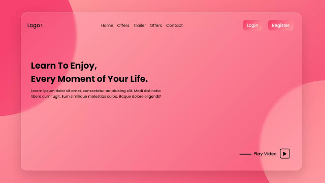
As you can see on the given image of this program [Glassmorphism Website Design], on the web page. On the top side, there is on navbar with some logos, hyperlinks, and two-button. Under the navigation menu, there is some text and at the bottom right side, there is one play button and some text. You can see in the outer top left corner and right bottom corner, there are two circles which give more attraction.
You want to know all this design on this program [Responsive Website Design], I have provided a full video tutorial of this program below. You will get all ideas and code behind this program [Responsive Gassmorphism Website],
Glassmorphism Website Design in HTML and CSS | Video Tutorial
As you have seen on the given video of this program [Responsive Website in HTML CSS], When i hovered on the hyperlink its color change smoothly and this is fully responsive, (Responsive means this website can fit in all sizes screen).
If You are familiar with HTML CSS then you can easily build this program [Website Design ]. Those friends who are feeling difficulty make this program, don’t worry I have provided all source code file below.
You Might Like This:
Glassmorphism Website Design | Source Code
To copy-paste all the code of this program [Glass Morphism Website Design], first of all, you need to create two files, one is an HTML file and another is a CSS file. After creating these two files you can easily copy-paste the given codes. You can also download all source code directly click on the given “Download Button”.
How To Create Gassmorphism Website in HTML?
Create an HTML file on your computer with the name index.html and copy-paste the given codes in your HTML document.
<!DOCTYPE html>
<!-- Created By CodingLab - www.codinglabweb.com -->
<html lang="en" dir="ltr">
  <head>
    <meta charset="UTF-8">
    <title> Glassmorphism Website | CodingLab </title>
    <link rel="stylesheet" href="style.css">
    <link rel="stylesheet" href="https://cdnjs.cloudflare.com/ajax/libs/font-awesome/5.15.2/css/all.min.css"/>
     <meta name="viewport" content="width=device-width, initial-scale=1.0">
   </head>
<body>
  <header>
    <nav class="navbar">
      <div class="logo"><a href="#">LOGO></a></div>
      <ul class="menu">
        <li><a href="#">Home</a></li>
        <li><a href="#">Latest</a></li>
        <li><a href="#">Offers</a></li>
        <li><a href="#">Services</a></li>
        <li><a href="#">Contact</a></li>
      </ul>
      <div class="buttons">
        <input type="button" value="Login">
        <input type="button" value="Register">
      </div>
    </nav>
    <div class="text-content">
      <h2>Learn To Enjoy,<br>Every Moment Of Your Life</h2>
      <p>Lorem ipsum dolor sit amet, consectetur adipisicing elit. Laborum facere in nam, officiis aspernatur consectetur aliquid sequi possimus et. Sint.</p>
    </div>
    <div class="play-button">
      <span class="play">Play Video</span>
      <i class="fas fa-play" onclick="click()"></i>
    </div>
  </header>
</body>
</html>
Create a CSS file with the name of index.html on your computer and copy-paste the given codes in your CSS file.
@import url('https://fonts.googleapis.com/css2?family=Poppins:wght@200;300;400;500;600;700&display=swap');
*{
  margin: 0;
  padding: 0;
  box-sizing: border-box;
  font-family: 'Poppins',sans-serif;
  transition: all 0.3s ease;
}
body{
  height: 100vh;;
  width: 100%;
  display: flex;
  background-image: linear-gradient( 135deg, #ff9a9e  10%, #F6416C 100%);
}
::selection{
  color: #f2f2f2;
  background: #f86d8d;
}
body::before,
body::after{
  content: '';
  position: absolute;
  left: 0;
  top: 0;
  height: 100%;
  width: 100%;
}
body::before{
  clip-path: circle(30% at left 20%);
  opacity: 0.4;
  background-image: linear-gradient( 135deg, #F6416C 10%, #ff9a9e 100%);
}
body::after{
  opacity: 0.4;
  clip-path: circle(25% at right 80%);
  background-image: linear-gradient( 135deg, #F6416C 10%, #ff9a9e 100%);
}
header{
  height: 85vh;
  width: 90%;
  background: rgba(255, 255, 255, 0.1);
  box-shadow: 0 20px 50px rgba(0, 0, 0, 0.15);
  border-top: 1px solid rgba(255, 255, 255, 0.5);
  border-left: 1px solid rgba(255, 255, 255, 0.5);
  backdrop-filter: blur(5px);
  z-index: 12;
  border-radius: 25px;
  margin: auto;
  position: relative;
}
header .navbar{
  margin: auto;
  width: 100%;
  padding: 35px 50px;
  border-radius: 25px;
  display: flex;
  justify-content: space-between;
  align-items: center;
}
.navbar .menu{
  display: flex;
  flex-wrap: wrap;
}
.navbar .logo a{
  text-decoration: none;
  font-size: 22px;
  color: #000;
  font-weight: 500;
}
.navbar .menu li{
  list-style: none;
  margin: 0 6px;
}
.navbar .menu a{
  color: #000;
  text-decoration: none;
  font-size: 17px;
  font-weight: 500;
  transition: all 0.3s ease;
}
.navbar .menu a:hover{
  color: #f2f2f2;
}
.navbar .buttons input{
  outline: none;
  color: #f2f2f2;
  font-size: 18px;
  font-weight: 500;
  border-radius: 12px;
  padding: 6px 15px;
  border: none;
  margin: 0 8px;
  cursor: pointer;
  transition: all 0.3s ease;
  background-image: linear-gradient( 135deg, #ff9a9e  10%, #F6416C 100%);
}
.navbar .buttons input:hover{
  transform: scale(0.97);
}
 header .text-content{
   width: 40%;
   margin: 100px 0 0 50px ;
 }
.text-content h2{
  font-size: 27px;
  font-weight: 600;
}
.text-content p{
  font-size: 15px;
  margin-top: 10px;
}
header .play-button{
  position: absolute;
  right: 50px;
  bottom: 40px;
}
.play-button .play{
  font-size: 18px;
  font-weight: 500;
}
 .play-button .play::before{
   content: '';
   position: absolute;
   height: 3px;
   width: 50px;
   top: 50%;
   transform: translateY(-50%);
   left: -58px;
   background: #000;
 }
.play-button i{
  height: 40px;
  width: 40px;
  border: 2px solid #000;
  line-height: 38px;
  text-align: center;
  margin-left: 10px;
  border-radius: 6px;
  cursor: pointer;
}
@media (max-width:850px) {
  header .navbar{
    flex-direction: column;
    align-items: center;
    justify-content: center;
    padding: 15px 5px;
  }
  .navbar .menu {
    margin: 10px 0 20px 0;
  }
  header .text-content{
    margin: 30px 0 0 20px ;
    width: 70%;
  }
  header .text-content h2{
    font-size: 20px;
  }
}
@media (max-width:410px) {
  header{
    height: 100vh;
    width: 100%;
    border-radius: 0px;
  }
  header .navbar{
    padding: 15px 10px;
}
}
Click on the following download button then glassmorphism source code file automatically starts to download. After it downloads, just you need to unzip all the files.


