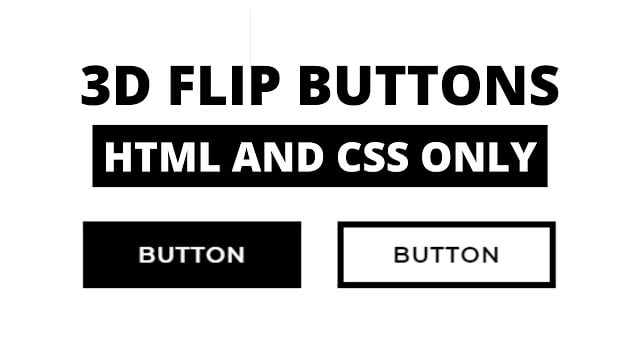
Hello readers, Today in this blog you’ll learn how to create 3D Flip Buttons in HTML & CSS. Earlier I have shared Glowing Hover Effects on CSS Buttons using HTML & CSS. Now it’s time to create a 3D Hover Effect or Animation on Buttons using only HTML & CSS.
A button is a fundamental UI element that will heavily affect your interaction design of the webpage. Buttons have the power to force users to convert, to act. Buttons are a middleman between the users and the products.
Today in this blog, I’ll share with you this Animated 3D Flip Button. At first, these buttons are in the initial stage where there are no 3D effects or animations. But when you hover on the specific button, that button rotates vertically with 3D visualization.
If you’re feeling difficult to understand what I am saying. You can watch a full video tutorial on this program (3D Flip Buttons).
Video Tutorial of 3D Flip Buttons in HTML & CSS
I hope you have understood the basic codes behind creating this 3D effect on Buttons. As you know I used only HTML & CSS to create this 3D effect. So you can call it this is a pure CSS program.
If you’re a beginner and you have basic knowledge of HTML & CSS then you can also create this type of 3D effect. After watching this video I believe that you liked this 3D Hover effect on CSS Buttons and I also believe that this short video helps a beginner to understand the basic concepts behind creating a 3D effect.
If you like these 3D Flip Buttons and want to get source codes. You can easily get the source codes of this program. To get the source codes you just need to scroll down.
3D Hover Effect on CSS Buttons [Source Codes]
To create this program (3D Flip Buttons). First, you need to create two Files one HTML File and another one is CSS File. After creating these files just paste the following codes in your file. First, create an HTML file with the name of index.html and paste the given codes in your HTML file. Remember, you’ve to create a file with .html extension.
<!DOCTYPE html>
<!-- Created By CodingNepal -->
<html lang="en" dir="ltr">
  <head>
    <meta charset="utf-8">
    <title>3D Flip Buttons</title>
    <link rel="stylesheet" href="style.css">
  </head>
  <body>
    <span><a href="#"></a></span>
    <span><a href="#"></a></span>

  </body>
</html>
Second, create a CSS file with the name of style.css and paste the given codes in your CSS file. Remember, you’ve to create a file with .css extension.
@import url('https://fonts.googleapis.com/css?family=Montserrat:600&display=swap');
body{
  margin: 0;
  padding: 0;
  display: flex;
  height: 100vh;
  align-items: center;
  justify-content: center;
  background:white;
}
span{
  position: relative;
  display: inline-flex;
  width: 180px;
  height: 55px;
  margin: 0 15px;
  perspective: 1000px;
}
span a{
  font-size: 19px;
  letter-spacing: 1px;
  transform-style: preserve-3d;
  transform: translateZ(-25px);
  transition: transform .25s;
  font-family: 'Montserrat', sans-serif;
}
span a:before,
span a:after{
  position: absolute;
  content: "BUTTON";
  height: 55px;
  width: 180px;
  display: flex;
  align-items: center;
  justify-content: center;
  border: 5px solid black;
  box-sizing: border-box;
}
span:nth-child(1) a:before{
  color: #fff;
  background: #000;
  transform: rotateY(0deg) translateZ(25px);
}
span:nth-child(1) a:after{
  color: #000;
  transform: rotateX(90deg) translateZ(25px);
}
span:nth-child(2) a:before{
  color: #fff;
  background: black;
  transform: rotateX(-90deg) translateZ(25px);
}
span:nth-child(2) a:after{
  color: #000;
  transform: rotateY(0deg) translateZ(25px);
}
span:nth-child(1) a:hover{
  transform: translateZ(-25px) rotateX(-90deg);
}
span:nth-child(2) a:hover{
  transform: translateZ(-25px) rotateX(90deg);
}
That’s all, now you’ve successfully created Animated 3D Flip Buttons using HTML & CSS. If your code not work or you’ve faced any error/problem then please comment down or contact us from the contact page.


