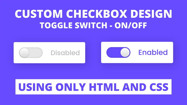
Hello readers, Today in this blog you’ll learn how to create Custom Checkbox or Toggle Switch using only HTML & CSS. Earlier I have shared a blog on how to create Password Show or Hide Toggle using JavaScript and now it’s time to create an On/Off Toggle Switch.
A checkbox, selection box, or tick box is a small interactive box that can be toggled by the user to show an affirmative or negative choice. And a toggle button lets the user change a setting between two states.
In this program (Custom Checkbox or Toggle Switch), on the webpage, there is a toggle switch and a text labeled as “Disabled”. When you click on that toggle switch or checkbox, the toggle switch or checkbox is on, enabled, or checked and the text is also changed into “Enabled”. When the toggle switch is on, the background color of the toggle and the color of the text is also changed.
You can also on/off the switch of the toggle by clicking on the label text and this is a pure CSS program, which means I used only HTML & CSS to create this toggle switch. You can watch a full video tutorial on this program (Custom Checkbox or Toggle Switch).
Video Tutorial of Custom Checkbox Design
In the video, you have seen the custom checkbox or toggle switch on/off button and I hope you have understood the basic codes behind creating this program. As I have already told you this is a pure CSS program and to make the text as a toggle button I used <label for=”click”> and <input type=”checkbox” id=”click”> now with this line of code, we can control the checkbox using the label.
But remember that, when you’re making labels as a toggle don’t forget to put the id name of the input tag inside the the attribute of label tag. If you like this program (Custom Checkbox Design) and want to get source codes. You can easily get the source codes of this program. To get the source codes you just need to scroll down. You can use this Toggle switch in your HTML pages and websites.
You might like this:
Custom Checkbox Design or Toggle Switch [Source Codes]
To create this program (Checkbox Design or Toggle Switch). First, you need to create two Files one HTML File and another one is CSS File. After creating these files just paste the following codes in your file.
First, create an HTML file with the name of index.html and paste the given codes in your HTML file. Remember, you’ve to create a file with .html extension.
<!DOCTYPE html>
<!-- Created By CodingNepal -->
<html lang="en" dir="ltr">
  <head>
    <meta charset="utf-8">
    <title>Custom Toggle Button | CodingLab</title>
    <link rel="stylesheet" href="style.css">
  </head>
  <body>
    <div class="checkbox">
      <input type="checkbox" id="click">
      <label for="click" class="text"></label>
    </div>
</body>
</html>
Second, create a CSS file with the name of style.css and paste the given codes in your CSS file. Remember, you’ve to create a file with .css extension.
@import url('https://fonts.googleapis.com/css?family=Poppins:400,500,600,700&display=swap');
*{
  margin: 0;
  padding: 0;
  box-sizing: border-box;
  font-family: 'Poppins', sans-serif;
}
html,body{
  display: grid;
  height: 100%;
  place-items: center;
  background: #664AFF;
}
.checkbox{
  height: 80px;
  width: 270px;
  padding: 20px;
  display: flex;
  background: #fff;
  align-items: center;
  border-radius: 5px;
  box-shadow: 5px 5px 30px rgba(0,0,0,.2);
  justify-content: space-between;
}
.checkbox input{
  outline: none;
  height: 40px;
  width: 90px;
  border-radius: 50px;
  -webkit-appearance: none;
  position: relative;
  background: #e6e6e6;
  box-shadow: inset 0 0 5px rgba(0,0,0,0.2);
  transition: 0.4s cubic-bezier(0.68, -0.55, 0.265, 1.55);
}
.checkbox input:checked{
  background: #664AFF;
}
.checkbox input:before{
  position: absolute;
  content: "";
  left: 0;
  height: 100%;
  width: 40px;
  background: linear-gradient(#fff,#f2f2f2,#e6e6e6,#d9d9d9);
  box-shadow: 0 2px 5px rgba(0,0,0,.2);
  border-radius: 50px;
  transform: scale(0.85);
  transition: left 0.4s cubic-bezier(0.68, -0.55, 0.265, 1.55);
}
input:checked:before{
  left: 50px;
}
.checkbox .text:before{
  content: "Disabled";
  font-size: 25px;
  font-weight: 500;
  color: #bfbfbf;
}
input:checked ~ .text:before{
  color: #664AFF;
  font-size: 27px;
  content: "Enabled";
}
That’s all, now you’ve successfully created a Custom Checkbox Design using only HTML & CSS. If your code doesn’t work or you’ve faced any error/problem then please comment down or contact us from the contact page.


