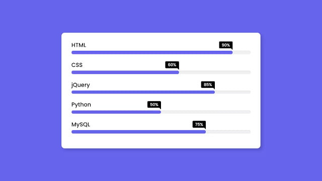
Hello readers, Today you’ll learn how to create an Animated Skills Bar using only HTML & CSS. Earlier I’ve shared a blog on how to create a Custom Animated Range Slider using JavaScript and now it’s time to create a pure CSS animated Skills Bar.
The Skill Bar allows you to show your info or skills stylishly and attractively in a form of percentage bars just like the horizontal bar. It is a quick, easy, and colorful way to display your skills to your site visitors and content viewers.
In this program [Animated Skill Bar], on the webpage, there are five skill bars with the skill titles and their skill percentages. These skills bars are purely based on HTML & CSS only and these bars also have animation, that means when you reload your webpage, these skill bars display horizontally with awesome animation.
If you’re feeling difficult to understand what I am saying. You can watch a full video tutorial on this program [Animated Skill Bar UI Design].
Video Tutorial of Animated Skills Bar UI Design
In the video, you’ve seen the animated skills bar and their animation too. I hope you’ve understood the basic codes behind creating this program. If you’re a beginner in the web design field then you can also create this type of skill bars or horizontal bars but you must know basic HTML & CSS. In this program, mainly CSS animation and @keyframes properties are used to create an animation on these bars.
If you like these Animated Skill Bars and want to get the source codes of this program. You can easily get the codes of this program from the below two boxes or you can also download code files and you can use this program on your projects, portfolio websites, and HTML pages.
You might like this:
Animated Skills Bar UI Design [Source Codes]
To create this program (Animated Skills Bar). First, you need to create two Files one HTML File and another one is CSS File. After creating these files just paste the following codes in your file. First, create an HTML file with the name of index.html and paste the given codes in your HTML file. Remember, you’ve to create a file with .html extension.
<!DOCTYPE html>
<!-- Created By CodingNepal -->
<html lang="en">
<head>
    <meta charset="UTF-8">
    <title>Animated Skills Bar | CodingNepal</title>
    <link rel="stylesheet" href="style.css">
</head>
<body>
  <div class="skill-bars">
    <div class="bar">
      <div class="info">
        <span>HTML</span>
      </div>
      <div class="progress-line html">
        <span></span>
      </div>
    </div>
    <div class="bar">
      <div class="info">
        <span>CSS</span>
      </div>
      <div class="progress-line css">
        <span></span>
      </div>
    </div>
    <div class="bar">
      <div class="info">
        <span>jQuery</span>
      </div>
      <div class="progress-line jquery">
        <span></span>
      </div>
    </div>
    <div class="bar">
      <div class="info">
        <span>Python</span>
      </div>
      <div class="progress-line python">
        <span></span>
      </div>
    </div>
    <div class="bar">
      <div class="info">
        <span>MySQL</span>
      </div>
      <div class="progress-line mysql">
        <span></span>
      </div>
    </div>
  </div>

</body>
</html>
Second, create a CSS file with the name of style.css and paste the given codes in your CSS file. Remember, you’ve to create a file with .css extension.
@import url('https://fonts.googleapis.com/css2?family=Poppins:wght@200;300;400;500;600;700&display=swap');
*{
  margin: 0;
  padding: 0;
  box-sizing: border-box;
  font-family: 'Poppins', sans-serif;
}
html,body{
  display: grid;
  height: 100%;
  place-items: center;
  background: #6665ee;
}
::selection{
  color: #fff;
  background: #6665ee;
}
.skill-bars{
  padding: 25px 30px;
  width: 600px;
  background: #fff;
  box-shadow: 5px 5px 20px rgba(0,0,0,0.2);
  border-radius: 10px;
}
.skill-bars .bar{
  margin: 20px 0;
}
.skill-bars .bar:first-child{
  margin-top: 0px;
}
.skill-bars .bar .info{
  margin-bottom: 5px;
}
.skill-bars .bar .info span{
  font-weight: 500;
  font-size: 17px;
  opacity: 0;
  animation: showText 0.5s 1s linear forwards;
}
@keyframes showText {
  100%{
    opacity: 1;
  }
}
.skill-bars .bar .progress-line{
  height: 10px;
  width: 100%;
  background: #f0f0f0;
  position: relative;
  transform: scaleX(0);
  transform-origin: left;
  border-radius: 10px;
  box-shadow: inset 0 1px 1px rgba(0,0,0,0.05),
              0 1px rgba(255,255,255,0.8);
  animation: animate 1s cubic-bezier(1,0,0.5,1) forwards;
}
@keyframes animate {
  100%{
    transform: scaleX(1);
  }
}
.bar .progress-line span{
  height: 100%;
  position: absolute;
  border-radius: 10px;
  transform: scaleX(0);
  transform-origin: left;
  background: #6665ee;
  animation: animate 1s 1s cubic-bezier(1,0,0.5,1) forwards;
}
.bar .progress-line.html span{
  width: 90%;
}
.bar .progress-line.css span{
  width: 60%;
}
.bar .progress-line.jquery span{
  width: 85%;
}
.bar .progress-line.python span{
  width: 50%;
}
.bar .progress-line.mysql span{
  width: 75%;
}
.progress-line span::before{
  position: absolute;
  content: "";
  top: -10px;
  right: 0;
  height: 0;
  width: 0;
  border: 7px solid transparent;
  border-bottom-width: 0px;
  border-right-width: 0px;
  border-top-color: #000;
  opacity: 0;
  animation: showText2 0.5s 1.5s linear forwards;
}
.progress-line span::after{
  position: absolute;
  top: -28px;
  right: 0;
  font-weight: 500;
  background: #000;
  color: #fff;
  padding: 1px 8px;
  font-size: 12px;
  border-radius: 3px;
  opacity: 0;
  animation: showText2 0.5s 1.5s linear forwards;
}
@keyframes showText2 {
  100%{
    opacity: 1;
  }
}
.progress-line.html span::after{
  content: "90%";
}
.progress-line.css span::after{
  content: "60%";
}
.progress-line.jquery span::after{
  content: "85%";
}
.progress-line.python span::after{
  content: "50%";
}
.progress-line.mysql span::after{
  content: "75%";
}
That’s all, now you’ve successfully created an Animated Skills Bar UI Design using only HTML & CSS. If your code doesn’t work or you’ve faced any error/problem then please comment down or contact us from the contact page.


