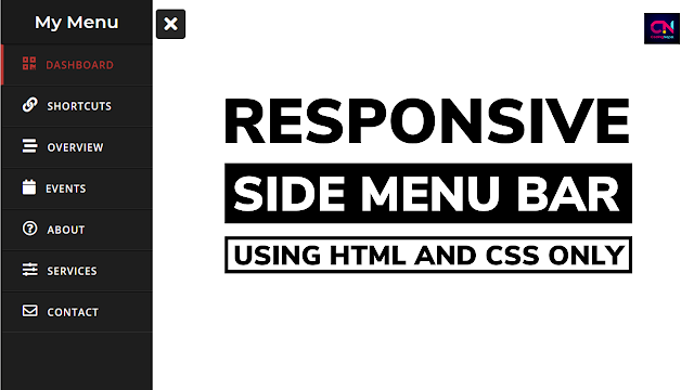
Hello reader, Today in this blog you’ll learn how to create a Responsive Sidebar Menu using HTML & CSS only. Previously I have shared a Sidebar Menu using HTML & CSS only which was not responsive, now it’s time to create a Responsive Side Navigation Menu Bar that slides from the left or right side.
As you can see in the image, this is a Side Menu Bar using HTML & CSS only. This is a cool, attractive, and fancy Sidebar Menu. While I was creating this Sidebar Menu. There are some menu items, icons, and some texts. There is a Sidebar Menu with the ‘X’ button on the image. But when you click on that ‘X’ button the sidebar menu sliding to the left side.
If you’re feeling difficulty understanding what I am saying. You can watch a full video tutorial on this program (Responsive Sidebar Menu).
Video Tutorial of Responsive Side Navigation Menu Bar
I hope you have understood the codes and concepts behind the creation of this Responsive Sidebar Menu. As you have seen in the video, this is a fully Responsive Sidebar Menu using HTML & CSS only. I have used HTML and CSS only to create this responsive sidebar menu. That’s mean this is a pure CSS program.
If you like this program (Responsive Sidebar Menu) and want to get source codes. You can easily get the source codes of this program. To get the source codes you just need to scroll down.
You might like this:
Responsive Side Menu Bar using HTML & CSS [Source Codes]
To create this program (Responsive Sidebar Menu). First, you need to create two Files one HTML File and another one is CSS File. After creating these files just paste the following codes in your file.
First, create an HTML file with the name of index.html and paste the given codes in your HTML file. Remember, you’ve to create a file with .html extension.
<!DOCTYPE html>
<!-- Created By CodingNepal -->
<html lang="en" dir="ltr">
  <head>
    <meta charset="utf-8">
    <!-- <title>Responsive Sidebar Menu</title> -->
    <link rel="stylesheet" href="style.css">
    <meta name="viewport" content="width=device-width, initial-scale=1.0">
    <link rel="stylesheet" href="https://cdnjs.cloudflare.com/ajax/libs/font-awesome/5.15.3/css/all.min.css"/>
  </head>
  <body>
    <input type="checkbox" id="check">
    <label for="check">
      <i class="fas fa-bars" id="btn"></i>
      <i class="fas fa-times" id="cancel"></i>
    </label>
    <div class="sidebar">
      <header>My Menu</header>
      <a href="#" class="active">
        <i class="fas fa-qrcode"></i>
        <span>Dashboard</span>
      </a>
      <a href="#">
        <i class="fas fa-link"></i>
        <span>Shortcuts</span>
      </a>
      <a href="#">
        <i class="fas fa-stream"></i>
        <span>Overview</span>
      </a>
      <a href="#">
         <i class="fas fa-calendar"></i>
        <span>Events</span>
      </a>
      <a href="#">
        <i class="far fa-question-circle"></i>
        <span>About</span>
      </a>
      <a href="#">
        <i class="fas fa-sliders-h"></i>
        <span>Services</span>
      </a>
      <a href="#">
        <i class="far fa-envelope"></i>
        <span>Contact</span>
      </a>
    </div>
</body>
</html>
Second, create a CSS file with the name of style.css and paste the given codes in your CSS file. Remember, you’ve to create a file with .css extension.
@import url('https://fonts.googleapis.com/css?family=Montserrat:600|Open+Sans:600&display=swap');
*{
  margin: 0;
  padding: 0;
  text-decoration: none;
}
.sidebar{
  position: fixed;
  width: 240px;
  left: -240px;
  height: 100%;
  background: #1e1e1e;
  transition: all .5s ease;
}
.sidebar header{
  font-size: 28px;
  color: white;
  line-height: 70px;
  text-align: center;
  background: #1b1b1b;
  user-select: none;
  font-family: 'Montserrat', sans-serif;
}
.sidebar a{
  display: block;
  height: 65px;
  width: 100%;
  color: white;
  line-height: 65px;
  padding-left: 30px;
  box-sizing: border-box;
  border-bottom: 1px solid black;
  border-top: 1px solid rgba(255,255,255,.1);
  border-left: 5px solid transparent;
  font-family: 'Open Sans', sans-serif;
  transition: all .5s ease;
}
a.active,a:hover{
  border-left: 5px solid #b93632;
  color: #b93632;
}
.sidebar a i{
  font-size: 23px;
  margin-right: 16px;
}
.sidebar a span{
  letter-spacing: 1px;
  text-transform: uppercase;
}
#check{
  display: none;
}
label #btn,label #cancel{
  position: absolute;
  cursor: pointer;
  color: white;
  border-radius: 5px;
  border: 1px solid #262626;
  margin: 15px 30px;
  font-size: 29px;
  background: #262626;
  height: 45px;
  width: 45px;
  text-align: center;
  line-height: 45px;
  transition: all .5s ease;
}
label #cancel{
  opacity: 0;
  visibility: hidden;
}
#check:checked ~ .sidebar{
  left: 0;
}
#check:checked ~ label #btn{
  margin-left: 245px;
  opacity: 0;
  visibility: hidden;
}
#check:checked ~ label #cancel{
  margin-left: 245px;
  opacity: 1;
  visibility: visible;
}
@media(max-width : 860px){
  .sidebar{
    height: auto;
    width: 70px;
    left: 0;
    margin: 100px 0;
  }
  header,#btn,#cancel{
    display: none;
  }
  span{
    position: absolute;
    margin-left: 23px;
    opacity: 0;
    visibility: hidden;
  }
  .sidebar a{
    height: 60px;
  }
  .sidebar a i{
    margin-left: -10px;
  }
  a:hover {
    width: 200px;
    background: inherit;
  }
  .sidebar a:hover span{
    opacity: 1;
    visibility: visible;
  }
}
That’s all, now you’ve successfully created a Responsive Sidebar Menu using HTML & CSS. If your code does not work or you’ve faced any error/problem then please download the source code files from the given download button. It’s free and a .zip file will be downloaded then you’ve to extract it.


