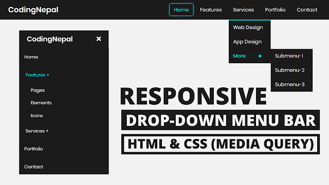
I’m sure that you know what is the dropdown menu and you may have seen it on different websites. A dropdown menu is a list of links or items that appears whenever the user clicks or hovers on it. Nowadays every website has a responsive navbar with a dropdown because with the help of dropdown we can easily organize listing by category and it is compulsory now for every website for the user conveniences.
In our Responsive Dropdown Menu Bar, as you can see in the preview image, there is a horizontal navbar with a dropdown. At first, the drop menu or submenu are hidden but when you hover on the particular nav link then the dropdown menu appears on the hovered link. There is visible a pretty cool box-shadow effect when you hover on the particular nav link.
This is a fully responsive navbar with a dropdown menu and it is created using only HTML & CSS. On the pc, this navbar is displayed horizontally but on mobile devices, this dropdown or navbar displayed vertically like a mobile menu. On mobile devices, you have to click on the nav link to show the dropdown menu but on pc, you have to hover.
If you’re feeling difficulty understanding what I am saying. You can watch a full video tutorial on this Responsive Dropdown Menu Bar.
Video Tutorial of Responsive Dropdown Menu Bar
In the video, you have seen the fully responsive dropdown menu and how it looks on mobile devices. I hope you have understood the codes behind creating this CSS dropdown menu. If you’re a beginner in web design and you only know basic HTML & CSS then you can also create this type of navbar or dropdown menu bar.
If you like this dropdown menu and to get the source codes then you can easily copy the codes of this dropdown from the given copy boxes or you can also download the source code files of this dropdown from the given download button and I also recommend you download the code files of this Responsive Dropdown Menu Bar tutorial instead of copy codes.
You might like this:
Responsive Dropdown Menu Bar [Source Codes]
To create this dropdown menu css. First, you need to create two Files one HTML File and another one is CSS File. After creating these files just paste the following codes into your file. You can also download the source code files of this dropdown menu css design from the below download button.
First, create an HTML file with the name of index.html and paste the given codes in your HTML file. Remember, you’ve to create a file with .html extension.
<!DOCTYPE html>
<!-- Created By CodingNepal - www.codingnepalweb.com -->
<html lang="en" dir="ltr">
   <head>
      <meta charset="utf-8">
      <title>Responsive Drop-down Menu Bar</title>
      <link rel="stylesheet" href="style.css">
      <script src="https://code.jquery.com/jquery-3.5.0.js"></script>
      <link rel="stylesheet" href="https://cdnjs.cloudflare.com/ajax/libs/font-awesome/5.15.3/css/all.min.css"/>
      <meta name="viewport" content="width=device-width, initial-scale=1.0">
   </head>
   <body>
      <nav>
         <div class="logo">
            CodingNepal
         </div>
         <label for="btn" class="icon">
         <span class="fa fa-bars"></span>
         </label>
         <input type="checkbox" id="btn">
         <ul>
            <li><a href="#">Home</a></li>
            <li>
               <label for="btn-1" class="show">Features +</label>
               <a href="#">Features</a>
               <input type="checkbox" id="btn-1">
               <ul>
                  <li><a href="#">Pages</a></li>
                  <li><a href="#">Elements</a></li>
                  <li><a href="#">Icons</a></li>
               </ul>
            </li>
            <li>
               <label for="btn-2" class="show">Services +</label>
               <a href="#">Services</a>
               <input type="checkbox" id="btn-2">
               <ul>
                  <li><a href="#">Web Design</a></li>
                  <li><a href="#">App Design</a></li>
                  <li>
                     <label for="btn-3" class="show">More +</label>
                     <a href="#">More <span class="fa fa-plus"></span></a>
                     <input type="checkbox" id="btn-3">
                     <ul>
                        <li><a href="#">Submenu-1</a></li>
                        <li><a href="#">Submenu-2</a></li>
                        <li><a href="#">Submenu-3</a></li>
                     </ul>
                  </li>
               </ul>
            </li>
            <li><a href="#">Portfolio</a></li>
            <li><a href="#">Contact</a></li>
         </ul>
      </nav>
      <div class="content">
         <header>Responsive Drop-down Menu Bar</header>
         <p>HTML and CSS (Media Query)</p>
      </div>
      <script>
         $('.icon').click(function(){
           $('span').toggleClass("cancel");
         });
      </script>
   </body>
</html>
Second, create a CSS file with the name of style.css and paste the given codes in your CSS file. Remember, you’ve to create a file with .css extension.
*{
  padding: 0;
  margin: 0;
  text-decoration: none;
  list-style: none;
  box-sizing: border-box;
}
body{
  font-family: montserrat;
}
nav{
  background: #0082e6;
  height: 80px;
  width: 100%;
}
label.logo{
  color: white;
  font-size: 35px;
  line-height: 80px;
  padding: 0 100px;
  font-weight: bold;
}
nav ul{
  float: right;
  margin-right: 20px;
}
nav ul li{
  display: inline-block;
  line-height: 80px;
  margin: 0 5px;
}
nav ul li a{
  color: white;
  font-size: 17px;
  padding: 7px 13px;
  border-radius: 3px;
  text-transform: uppercase;
}
a.active,a:hover{
  background: #1b9bff;
  transition: .5s;
}
.checkbtn{
  font-size: 30px;
  color: white;
  float: right;
  line-height: 80px;
  margin-right: 40px;
  cursor: pointer;
  display: none;
}
#check{
  display: none;
}
@media (max-width: 952px){
  label.logo{
    font-size: 30px;
    padding-left: 50px;
  }
  nav ul li a{
    font-size: 16px;
  }
}
@media (max-width: 858px){
  .checkbtn{
    display: block;
  }
  ul{
    position: fixed;
    width: 100%;
    height: 100vh;
    background: #2c3e50;
    top: 80px;
    left: -100%;
    text-align: center;
    transition: all .5s;
  }
  nav ul li{
    display: block;
    margin: 50px 0;
    line-height: 30px;
  }
  nav ul li a{
    font-size: 20px;
  }
  a:hover,a.active{
    background: none;
    color: #0082e6;
  }
  #check:checked ~ ul{
    left: 0;
  }
}
section{
  background: url(bg1.jpg) no-repeat;
  background-size: cover;
  height: calc(100vh - 80px);
}
That’s all, now you’ve successfully created a Responsive Dropdown Menu using HTML CSS & JavaScript. If your code doesn’t work or you’ve faced any error/problem then please download the source code files from the given download button. It’s free and a .zip file will be downloaded then you’ve to extract it.


