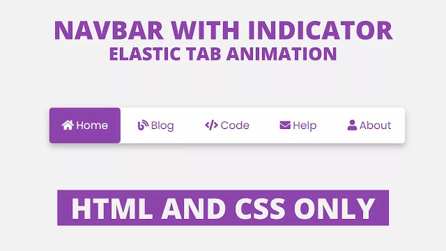
Hello Readers, welcome to my other blog. In this, I will create an Elastic Tab Animation on Navigation Bar with the help of HTML & CSS. Earlier I have shared How to create an Animated Profile card and now, it’s time to create elastic tabs.
In simple language, elastic tabs mean a specific height and width of hyperlinks where the user clicked to quickly move on a particular webpage within the website. Tabs (hyperlinks) are the most important part of the website to makes user works easier and convenient.
As you can see at a given image on the webpage. There is a horizontal long bar on the webpage, there is a total of five links with different names and their icons. In this program when we hover in those tabs (hyperlinks) light background color appears and when we clicked on a specific tab then right side colored box moves in a tab where we clicked..
If you are feeling difficulty to understand this program[Elastic Tab Animation using HTML & CSS]. You can watch a full video tutorial about this program. I’m sure all your confusion will be cleared after watching this tutorial of an elastic tab animation.
Full Video Tutorial of Elastic Tab Animation using HTML and CSS
As you have seen in the given video. At first, there was a lengthy box on the screen, when we hover a particular tabs light background color appears. I have programmed this hover effect on all tabs(hyperlinks). There was an active button on the right side with background color and its text was white. When we clicked on the specific tab that colored box moves into that tab where we have clicked. I have made this program[Elastic Tab Animation using HTML & CSS].
If you have basic knowledge of HTML & CSS, then you can easily develop this elastic tab animation. Those friends who are feeling difficulty to build this program, don’t worry I have provided all source code files below. You can copy and paste codes from there. Feel free to use this program in you projects.
You Might Like This:
Elastic Tab Animation [Source Codes]
Listen, to copy these given codes of this program [Elastic Tab Animation for Navbar], you need to create HTML & CSS files, after creating these two files you can copy-paste the following codes in your HTML CSS files. You can also download all source code files from the given “Download Button”.
<!DOCTYPE html>
<!-- Created By CodingLab - www.codinglabweb.com -->
<html lang="en" dir="ltr">
  <head>
    <meta charset="UTF-8">
    <title> Animated Image Gallery | CodingLab </title>
    <link rel="stylesheet" href="style.css">
    <link rel="stylesheet" href="https://cdnjs.cloudflare.com/ajax/libs/font-awesome/5.15.2/css/all.min.css"/>
   </head>
<body>
  <div class="container">
    <input type="radio" name="s" id="home" checked>
    <input type="radio" name="s" id="blog">
    <input type="radio" name="s" id="code">
    <input type="radio" name="s" id="help">
    <input type="radio" name="s" id="about">
    <nav>
      <div class="slider"></div>
      <label class="home" for="home">
      <i class="fas fa-home"></i>Home
      </label>
      <label class="blog" for="blog">
      <i class="fas fa-blog"></i>Blog
      </label>
      <label class="code" for="code">
        <i class="fas fa-code"></i>Code
      </label>
      <label class="help" for="help">
        <i class="fas fa-envelope"></i>Help
      </label>
      <label class="about" for="about">
        <i class="fas fa-user"></i>About
      </label>
    </nav>
  </div>
</body>
</html>
@import url('https://fonts.googleapis.com/css2?family=Poppins:wght@200;300;400;500;600;700&display=swap');
*{
  margin: 0;
  padding: 0;
  box-sizing: border-box;
  font-family: 'Poppins',sans-serif;
}
body{
  height: 100vh;
  width: 100%;
  display: flex;
  justify-content: center;
  align-items: center;
  background: #f2f2f2;
}
nav{
  width: 600px;
  height: 60px;
  border-radius: 5px;
  display: flex;
  text-align: center;
  position: relative;
  background: #fff;
  box-shadow: 0 5px 10px rgba(0, 0, 0, 0.25);
}
nav label{
  width: 100%;
  height: 100%;
  line-height: 60px;
  font-size: 18px;
  font-weight: 400;
  border-radius: 5px;
  margin: 0 5px;
  color: #8e44ad;
  position: relative;
  z-index: 1;
  cursor: pointer;
  transition: all 0.3s ease;
}
nav label:hover{
background: rgba(142, 68, 173, 0.3);
}
nav label i{
  margin-right: 4px;
}
nav .slider{
  position: absolute;
  height: 100%;
  width: 20%;
  background: #8e44ad;
  left: 0;
  top: 0;
  border-radius: 5px;
  transition: all 0.4s cubic-bezier(0.68, -0.55, 0.265, 1.55);
  z-index: 1;
}
#home:checked ~ nav label.home,
#blog:checked ~ nav label.blog,
#code:checked ~ nav label.code,
#help:checked ~ nav label.help,
#about:checked ~ nav label.about{
  color: #fff;
}
#blog:checked ~ nav .slider{
left: 20%;
}
#code:checked ~ nav .slider{
left: 40%;
}
#help:checked ~ nav .slider{
left: 60%;
}
#about:checked ~ nav .slider{
left: 80%;
}
input[type=radio]{
  display: none;
}


