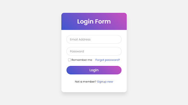
Hello readers, Today in this blog you’ll learn how to create an Animated Login Form with Floating Label Animation using only HTML & CSS. Earlier I have shared a blog on how to create a Responsive Chat Box Design and now I’m going to create a Login Form with Floating Label Animation.
A Login Form is a collection of credentials used to validate a user. Most often, these consist of a username and password. The login form is used by websites, computer applications, and mobile apps. A floating label is a text that appears inside the input field. When the user interacted with the input, the label “floats” above and making room for the user to input a value.
In this program (Login Form with Floating Label Animation), on the webpage, there is a Login Form with two input fields – Email and Password, a forgot password link, remember me checkbox, a button, and a signup link. When you focus on the input field, the label or text of the input float above. If you’re feeling difficult to understand what I am saying. You can watch a full video tutorial on this program.
Video Tutorial of Login Form with Floating Label Animation
In the video, you’ve seen the Login Form with Floating Label Animation and I hope you’ve understood the basic codes behind creating this program. This is a pure CSS program so when you entered your info and submit the form, it won’t redirect you to any other pages/sites. If you know JavaScript, then you add some advanced features on this form like – validation of the input field, show or hide the password toggle button, and many more.
If you like this program (Login Form with Floating Label Animation) and want to get source codes. You can easily get the source codes of this program. To get the source codes you just need to scroll down. You can use this Login Form in your HTML pages, websites, and projects.
You might like this:
Login Form with Floating Label Animation [Source Codes]
To create this program (Login Form with Floating Label Animation). First, you need to create two Files one HTML File and another one is CSS File. After creating these files just paste the following codes in your file.
First, create an HTML file with the name of index.html and paste the given codes in your HTML file. Remember, you’ve to create a file with .html extension.
<!DOCTYPE html>
<!-- Created By CodingNepal -->
<html lang="en" dir="ltr">
   <head>
      <meta charset="utf-8">
      <title>Login Form Design | CodeLab</title>
      <link rel="stylesheet" href="style.css">
   </head>
   <body>
      <div class="wrapper">
         <div class="title">
            Login Form
         </div>
         <form action="#">
            <div class="field">
               <input type="text" required>
               <label>Email Address</label>
            </div>
            <div class="field">
               <input type="password" required>
               <label>Password</label>
            </div>
            <div class="content">
               <div class="checkbox">
                  <input type="checkbox" id="remember-me">
                  <label for="remember-me">Remember me</label>
               </div>
               <div class="pass-link">
                  <a href="#">Forgot password?</a>
               </div>
            </div>
            <div class="field">
               <input type="submit" value="Login">
            </div>
            <div class="signup-link">
               Not a member? <a href="#">Signup now</a>
            </div>
         </form>
      </div>
   </body>
</html>
Second, create a CSS file with the name of style.css and paste the given codes in your CSS file. Remember, you’ve to create a file with .css extension.
@import url('https://fonts.googleapis.com/css?family=Poppins:400,500,600,700&display=swap');
*{
  margin: 0;
  padding: 0;
  box-sizing: border-box;
  font-family: 'Poppins', sans-serif;
}
html,body{
  display: grid;
  height: 100%;
  width: 100%;
  place-items: center;
  background: #f2f2f2;
  /* background: linear-gradient(-135deg, #c850c0, #4158d0); */
}
::selection{
  background: #4158d0;
  color: #fff;
}
.wrapper{
  width: 380px;
  background: #fff;
  border-radius: 15px;
  box-shadow: 0px 15px 20px rgba(0,0,0,0.1);
}
.wrapper .title{
  font-size: 35px;
  font-weight: 600;
  text-align: center;
  line-height: 100px;
  color: #fff;
  user-select: none;
  border-radius: 15px 15px 0 0;
  background: linear-gradient(-135deg, #c850c0, #4158d0);
}
.wrapper form{
  padding: 10px 30px 50px 30px;
}
.wrapper form .field{
  height: 50px;
  width: 100%;
  margin-top: 20px;
  position: relative;
}
.wrapper form .field input{
  height: 100%;
  width: 100%;
  outline: none;
  font-size: 17px;
  padding-left: 20px;
  border: 1px solid lightgrey;
  border-radius: 25px;
  transition: all 0.3s ease;
}
.wrapper form .field input:focus,
form .field input:valid{
  border-color: #4158d0;
}
.wrapper form .field label{
  position: absolute;
  top: 50%;
  left: 20px;
  color: #999999;
  font-weight: 400;
  font-size: 17px;
  pointer-events: none;
  transform: translateY(-50%);
  transition: all 0.3s ease;
}
form .field input:focus ~ label,
form .field input:valid ~ label{
  top: 0%;
  font-size: 16px;
  color: #4158d0;
  background: #fff;
  transform: translateY(-50%);
}
form .content{
  display: flex;
  width: 100%;
  height: 50px;
  font-size: 16px;
  align-items: center;
  justify-content: space-around;
}
form .content .checkbox{
  display: flex;
  align-items: center;
  justify-content: center;
}
form .content input{
  width: 15px;
  height: 15px;
  background: red;
}
form .content label{
  color: #262626;
  user-select: none;
  padding-left: 5px;
}
form .content .pass-link{
  color: "";
}
form .field input[type="submit"]{
  color: #fff;
  border: none;
  padding-left: 0;
  margin-top: -10px;
  font-size: 20px;
  font-weight: 500;
  cursor: pointer;
  background: linear-gradient(-135deg, #c850c0, #4158d0);
  transition: all 0.3s ease;
}
form .field input[type="submit"]:active{
  transform: scale(0.95);
}
form .signup-link{
  color: #262626;
  margin-top: 20px;
  text-align: center;
}
form .pass-link a,
form .signup-link a{
  color: #4158d0;
  text-decoration: none;
}
form .pass-link a:hover,
form .signup-link a:hover{
  text-decoration: underline;
}
That’s all, now you’ve successfully created a Login Form with Floating Label Animation using only HTML & CSS. If your code doesn’t work or you’ve faced any error/problem then please comment down or contact us from the contact page.


