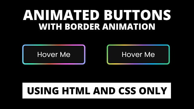
Hello readers, Today in this blog you’ll learn how to create an Animated Button with Border Hover Animation using only HTML & CSS. Earlier I have shared a blog on how to create a Colorful Gradient Glowing Effect on Buttons using CSS and now I’m going to create a Border Animation on Button.
Button refers to any graphical control element that gives the user an easy way to trigger an event, like searching for a question in a search engine or to associated with dialog boxes, like confirming an action. If the action is to create, edit, delete, or anything else to any piece of information, there is also use a button.
In this program (Button with Border Hover Animation), at first, on the webpage, there is a button with a gradient border and when you hover on it then the border of the button starts to animate, moving, or glowing. When you exit or out your mouse pointer from the button, the border stops animating. This type of border animation on the button you may have seen on the codepen.
If you’re feeling difficult to understand what I am saying. You can watch a full video tutorial on this program (Border Hover Animation).
Video Tutorial of Button with Border Hover Animation
In the video, you have seen the button hover animation and I hope you have understood the basic codes behind creating this animation. This is a pure CSS program that means I used only HTML & CSS to create this button and their border animation. So if you’re a beginner then you can also create this type of animation with a few lines of CSS codes.
If you like this program (Border Hover Animation) and want to get source codes. You can easily get the source codes of this program. To get the source codes you just need to scroll down. You can use this button on your HTML pages, websites, and projects.
You might like this:
Border Hover Animation on Buttons [Source Codes]
To create this program (Border Hover Animation). First, you need to create two Files one HTML File and another one is CSS File. After creating these files just paste the following codes in your file.
First, create an HTML file with the name of index.html and paste the given codes in your HTML file. Remember, you’ve to create a file with .html extension.
<!DOCTYPE html>
<!-- Created By CodingNepal -->
<html lang="en" dir="ltr">
  <head>
    <meta charset="utf-8">
    <title>Button Border Animation | CodingNepal</title>
    <link rel="stylesheet" href="style.css">
  </head>
  <body>
    <div class="btn">
      <a href="#"><span>Hover Me</span></a>
    </div>
</body>
</html>
Second, create a CSS file with the name of style.css and paste the given codes in your CSS file. Remember, you’ve to create a file with .css extension.
@import url('https://fonts.googleapis.com/css?family=Poppins:400,500,600,700&display=swap');
*{
  margin: 0;
  padding: 0;
  box-sizing: border-box;
  font-family: 'Poppins', sans-serif;
}
html,body{
  display: grid;
  height: 100vh;
  place-items: center;
  background: #000;
}
.btn a{
  position: relative;
  color: #f5f5f5;
  height: 70px;
  width: 220px;
  display: block;
  text-align: center;
  border-radius: 10px;
  text-decoration: none;
  background-image: linear-gradient(115deg,#4fcf70,#fad648,#a767e5,#12bcfe,#44ce7b);
}
.btn a:hover{
  animation: rotate 0.4s linear infinite;
}
@keyframes rotate {
  100%{
    filter: hue-rotate(-360deg)
  }
}
.btn a span{
  height: 88%;
  width: 96%;
  background: #111;
  display: block;
  position: absolute;
  top: 50%;
  left: 50%;
  border-radius: 6px;
  line-height: 62px;
  font-size: 25px;
  transform: translate(-50%, -50%);
}
That’s all, now you’ve successfully created an Animated Button with Border Hover Animation using HTML & CSS. If your code doesn’t work or you’ve faced any error/problem then please comment down or contact us from the contact page.


